Preview image. Unlock full-res
A recruitment brand identity leveraging a bold orange-to-purple gradient, complementary color contrast, and a silhouette figure to signal human-centered staffing services.
Summary
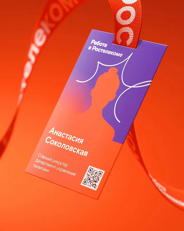
A business-card design for an HR staffing firm layering a silhouette portrait, Russian Cyrillic text on a split gradient background (warm orange-red below, cool purple above), and a QR code to link physical collateral.
Visual description
A branded business card angled in a 3D product shot against a vibrant orange background. The card itself is divided diagonally: the lower half features a warm orange-to-red gradient with white Cyrillic typography (company name and title); the upper half transitions to a cool purple with an orange silhouette figure in profile. A white outline of a smile curves through the figure to add warmth and humanity. White sans-serif text spans the left edge. A QR code sits in the lower-right corner in white. The overall color palette is a strong complementary split (warm/cool), creating visual tension and energy typical of modern recruitment branding.
Key takeaway
The diagonal split-gradient approach creating two distinct zones within a single surface. The profile silhouette as a human-centered symbol for staffing. The high color saturation and warm-cool contrast making the collateral memorable and photo-worthy.
Reuse notes
Ideal for recruitment firms, HR tech, or talent-management startups wanting to convey energy and approachability. The vibrant palette works in physical collateral (cards, flyers) where the gradient can be glossy or matte. Best used where the audience expects personality and modern branding (tech-forward candidates or younger markets).