
Preview image. Unlock full-res
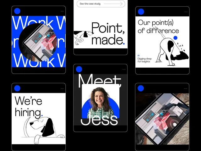
Agency brand system pairing bold white typography and blue accents against dark cards, with minimalist line-art character illustrations and product photography.
Summary
A cohesive brand system for a creative agency, built around dark cards showcasing bold white headlines, blue dot accents, minimalist line-art characters, and lifestyle photography of team and product.
Visual description
Six dark rectangular cards arranged in a loose grid against a black background. The top-left card displays a large blue circle framing a rotated product photo showing pink and teal geometric shapes; overlaid is the white text "Week W" (partial headline). The top-center card shows the tagline "Point, made." with a hand-drawn arm gesture in black line art. The top-right card features "Our point(s) of difference" with a minimalist sitting figure and "Digging deep for insights" as supporting copy. Bottom-left shows "We're hiring." with a friendly line-art dog face. The center card displays "Meet Jess" (team member intro) with a blue circular portrait crop and a person's face. Bottom-right shows a tilted product photo on wood grain. Every card has a small blue circle in the top-left corner, functioning as a consistent mark.
Key takeaway
The consistent blue dot as a unifying visual anchor across diverse card types. The restraint in combining two illustration styles (loose line art + real photography) without visual conflict. The rhythm of alternating text-heavy and image-heavy cards to maintain scanning ease in a grid.
Reuse notes
Strong pattern for consulting, design agency, or tech company hiring/culture work. The loose grid and dark background allow cards to breathe without frames. Best when you have genuine team personalities and product beauty to showcase.
More like this


Keep what you find
A free account saves references to boards and can send you a weekly email of picks based on what you save.
To see every result, go Pro.