Preview image. Unlock full-res
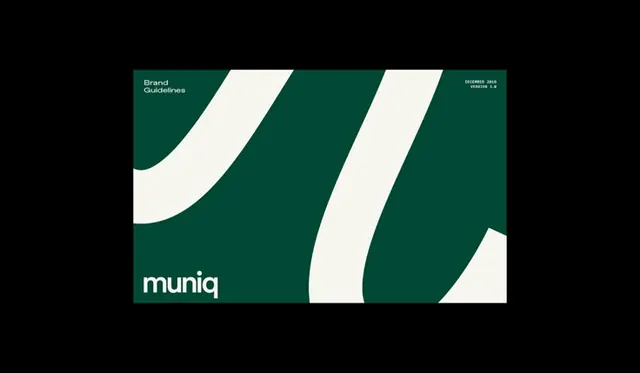
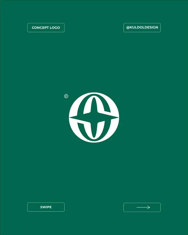
A teal-and-cream brand mark that uses flowing, organic curves to build a wordmark and dividing forms.
Summary
A teal-and-cream brand mark that uses flowing, organic curves to build a wordmark and dividing forms.
Visual description
Teal background divided by two thick, sweeping cream curves that flow from corner to corner. The wordmark "muniq" sits in white sans-serif at lower left. A small version notation appears at top right. The curves follow a wave or ribbon pattern, creating asymmetric negative space. The cream forms have soft edges where they meet the teal ground, maintaining the geometric vocabulary while avoiding hard, sharp corners.
Key takeaway
The pair of curves working as both primary brand forms and compositional dividers. Using the same curve style repeatedly (both the large flowing shapes and the internal negative space) creates visual cohesion. The high-contrast teal/cream pairing reads clean on any background.
Reuse notes
Strong for tech or lifestyle brands wanting geometric precision with organic warmth. The curved forms photograph well on packaging or environmental applications. Works equally at icon scale (just the curves) and full-width lockup.
More like this





Keep what you find
A free account saves references to boards and can send you a weekly email of picks based on what you save.
To see every result, go Pro.