Preview image. Unlock full-res
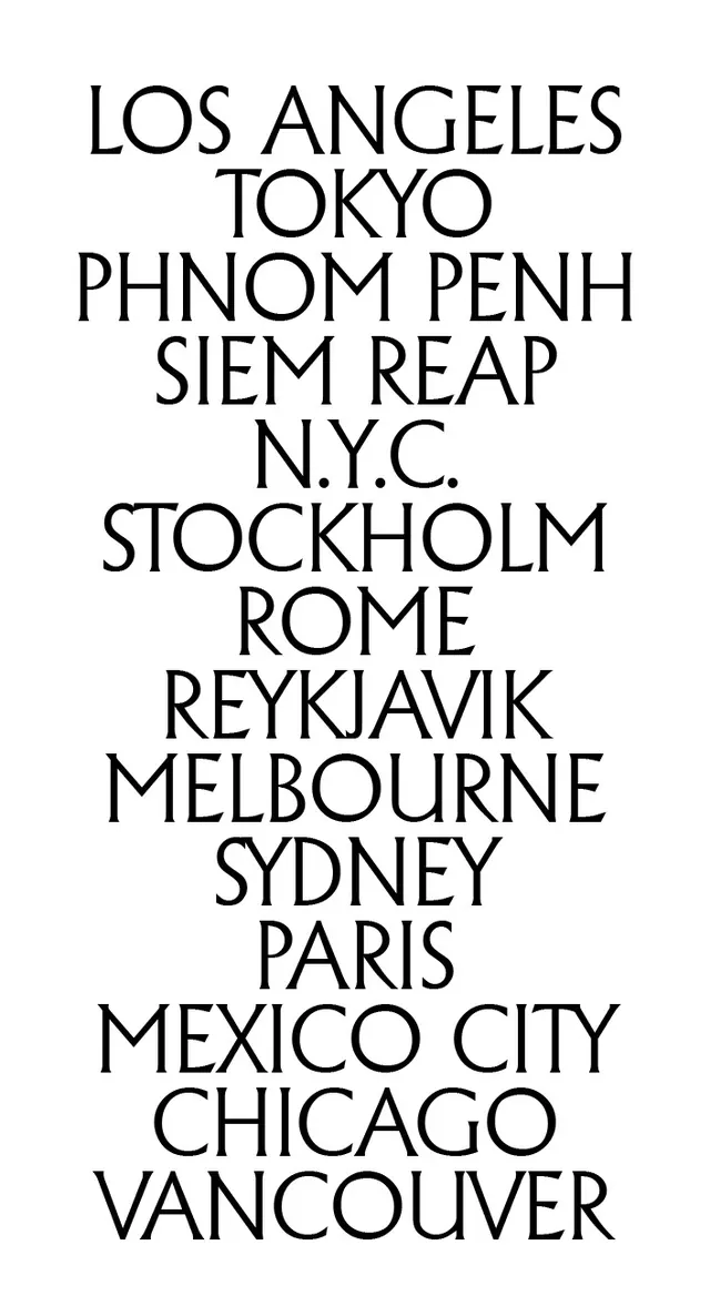
A centered vertical list of international city names set in a large, elegant display sans-serif, showcasing typographic clarity and scale across a minimal monochromatic composition.
Summary
A typographic composition of global city names (Los Angeles, Tokyo, Phnom Penh, Stockholm, Sydney, etc.) arranged in a centered vertical list, rendered in a large, confident sans-serif display face on a white background.
Visual description
Twelve city names are stacked vertically and centered on a white background, each on a single line in uniform black sans-serif type. The typeface is modern and spacious, with generous letterspacing and leading that lets each name breathe. The list spans continents and time zones: Los Angeles at top, followed by Tokyo, Phnom Penh, Siem Reap, N.Y.C., Stockholm, Rome, Reykjavik, Melbourne, Sydney, Paris, Mexico City, Chicago, and Vancouver. The symmetrical alignment and consistent scale emphasize the equal importance of each destination, while the careful spacing suggests both a curated editorial sensibility and functional clarity, as if the list itself were a legible typographic system.
Key takeaway
The principle of letting generous spacing and a beautiful typeface do the work instead of decorative elements or color variation. The vertical, centered list creates a sense of contemplation and order, signaling quality and intentionality. The global reach is communicated by the breadth of locations, not by imagery or visual metaphor. The monochromatic palette ensures the type remains the sole focus.
Reuse notes
Ideal for travel brands, hospitality groups, and editorial publishers seeking elegance through restraint. Works well as a brand showcase, a service-location indicator, or a table of contents. Pair with smaller body copy or navigation elsewhere on the page to avoid visual monotony. The large scale demands truly excellent typeface metrics; this approach will expose weak type choices, so invest in a high-quality display font.
More like this





Keep what you find
A free account saves references to boards and can send you a weekly email of picks based on what you save.
To see every result, go Pro.