Preview image. Unlock full-res
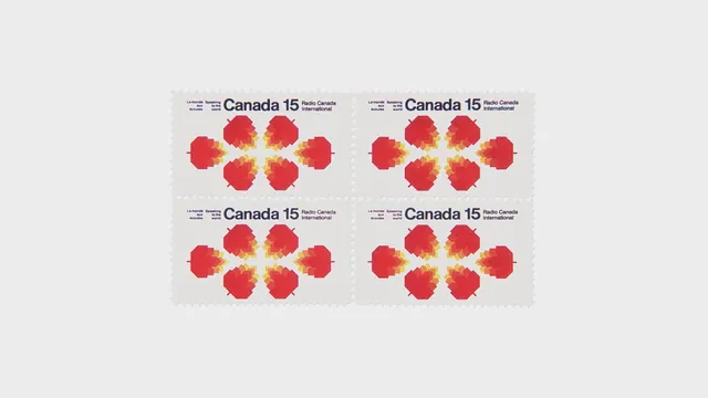
A set of four logo variations for Canada 150, featuring a stylized red maple leaf with a gradient effect and accompanying text.
Summary
A set of four logo variations for Canada 150, featuring a stylized red maple leaf with a gradient effect and accompanying text.
Visual description
Four distinct logo layouts featuring a red maple leaf with a yellow-to-orange gradient. The text 'Canada 150' is paired with the leaf in different orientations and sizes.
Key takeaway
The design uses a vibrant gradient on a national symbol to create a modern, celebratory identity.
Reuse notes
The maple leaf icon and gradient style can be adapted for various commemorative branding materials.
More like this






Keep what you find
A free account saves references to boards and can send you a weekly email of picks based on what you save.
To see every result, go Pro.