Preview image. Unlock full-res
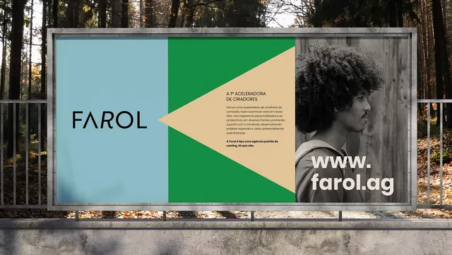
A public billboard campaign for FAROL using bold color blocking in forest green, pale cream, and slate grey with asymmetric geometric composition.
Summary
A roadside billboard divides its landscape format into four distinct zones using Swiss-style geometric color blocking and a centered portrait.
Visual description
A large horizontal billboard mounted on a metal frame in a forest setting. The composition splits into four distinct sections: left light blue with 'FAROL' wordmark in bold sans-serif, a forest-green diagonal triangle slicing inward, a pale cream vertical band containing Portuguese body text ('A P.ACELERADORA DE CRIADORES'), and a right section with a black-and-white portrait photograph of a person with curly hair printed over grey. The proportions force asymmetry that creates visual tension across the format. Sans-serif type is clean and widely spaced, characteristic of contemporary institutional branding.
Key takeaway
Diagonal cutting planes across a horizontal format create drama without ornamentation. The color palette (forest green, cream, grey, and one portrait) achieves sophistication through restraint, avoiding loud primaries. The asymmetric three-to-one layout weighted to white space and portraiture reads as confident and progressive, not chaotic. Text as content (the institutional mission statement visible but not shouted) humanizes a public billboard.
Reuse notes
Strong approach for nonprofits, cultural institutions, or agencies claiming progressive values. The diagonal composition works outdoors (readable from moving vehicles) but may feel forced on screen at small scale. Portrait inclusion adds approachability to institutional messaging. The palette (greens and earth tones) suggests environmental or arts organizations; adjust the hues for healthcare or education.
More like this




Keep what you find
A free account saves references to boards and can send you a weekly email of picks based on what you save.
To see every result, go Pro.