Preview image. Unlock full-res
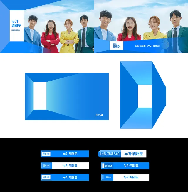
Television network branding with cast photography, geometric logo marks, and structured color-coded system.
Summary
A television network identity system combining cast photography, geometric logo blocks, and color-coded notation to establish a cohesive visual system across media properties.
Visual description
Header shows eight people in professional attire against a horizontal blue gradient background. Below, a structured grid layout presents two geometric mark variations in bright blue: a squared shape with a rotated off-white square inside, and a directional arrow. At the bottom, a black background displays six labeled color blocks in blue and white, with abbreviations and labels indicating usage rules or system variations.
Key takeaway
The use of geometric marks paired with cast imagery to humanize a corporate system; the grid-based layout that accommodates both brand marks and functional system notation without clutter; the confident use of a limited blue-and-neutral palette that reads as broadcast-professional.
Reuse notes
Strong reference for media companies, entertainment networks, or corporate identity systems where human connection and systematic clarity both matter. Works well when you need to show both brand personality (people) and structural consistency (geometry).