Preview image. Unlock full-res
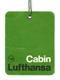
A die-cut green hang-tag with Lufthansa crane logo and cabin class label, exemplifying corporate minimalism in functional branding.
Summary
A die-cut green hang-tag in muted forest tones displaying Lufthansa's geometric crane logo and "Cabin Lufthansa" text in stacked sans-serif. A masterclass in constrained corporate identity applied to functional airline collateral.
Visual description
A rounded-corner rectangular tag in durable stock, colored a muted dark green. The tag has a punch hole at the top for stringing. The Lufthansa crane logo appears upper-left as a simple geometric mark in a lighter shade. Below, white sans-serif text stacks as "Cabin" (lighter weight) over "Lufthansa" (darker, bolder weight), occupying the lower two-thirds. The overall composition is deeply asymmetric, anchoring identity to one corner while leaving breathing room. The color is sophisticated, neither primary nor dark, and the typography choices communicate official use without ornament.
Key takeaway
The discipline of the crane logo as pure geometric mark, reducible to icon scale without loss of recognition. The typographic hierarchy built through weight differentiation and case rather than size shifts. The use of muted, sophisticated color on utilitarian items to elevate perceived quality and trust.
Reuse notes
Perfect reference for functional branding in travel, logistics, and service industries where items are handled repeatedly. The geometry translates well across scales, from full-size applications to small-screen icon rendering. Works especially well where a cool, calm, trustworthy tone is required and a single color palette keeps production costs low.