Preview image. Unlock full-res
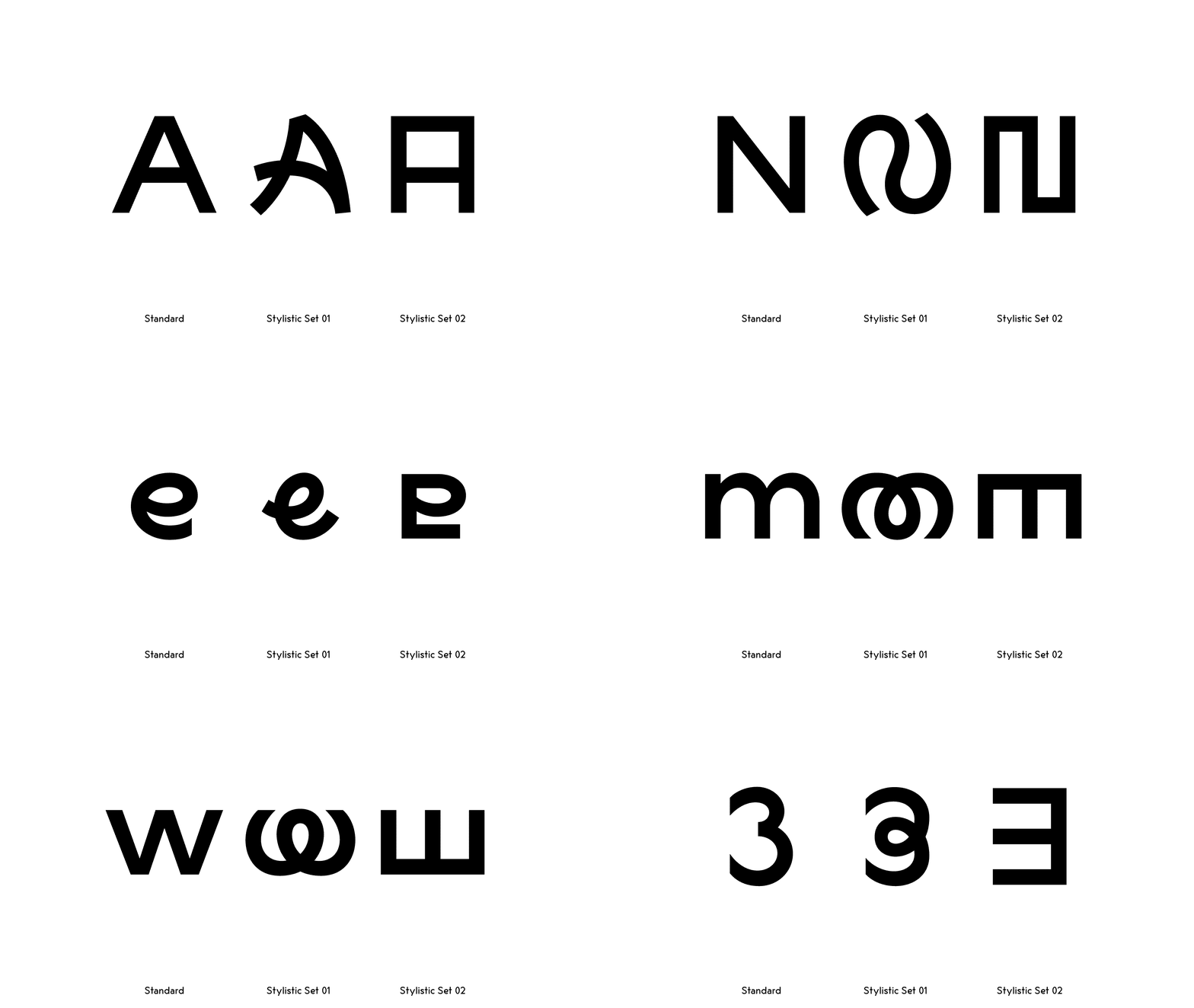
Three geometric interpretations of uppercase A arranged horizontally, showing standard and two stylistic alternate renderings with varying line weights and internal shapes.
Summary
Three black-on-white renderings of the letter A showing standard geometric form, curved stylistic alternate with arced spine, and rectangular alternate with horizontal bar divisions.
Visual description
Three versions of the uppercase letter A arranged horizontally across a white field, labeled below as "Standard," "Stylistic Set 01," and "Stylistic Set 02." The first is a classic A with triangular counter and thin apex. The second A features a curved spine and angled internal geometry, suggesting a more flowing interpretation. The third A appears as a rectangular frame with two horizontal divisions, creating a more architectural, modular look. All three glyphs use thick, bold strokes and are rendered in solid black. The baseline is consistent across all three, and generous margins separate each version.
Key takeaway
The clarity of showing design evolution within a single character set through systematic variations. The visual logic of how a single geometric concept (A) can shift interpretation while maintaining legibility. Useful for demonstrating a font's stylistic alternates or design-system flexibility.
Reuse notes
Ideal for type designers presenting glyph alternates or for identity systems that want to show modular, geometric flexibility. Works well in font marketing, design documentation, or multi-variant branding systems. The monochromatic palette keeps focus on form over decoration.
More like this



Keep what you find
A free account saves references to boards and can send you a weekly email of picks based on what you save.
To see every result, go Pro.