Preview image. Unlock full-res
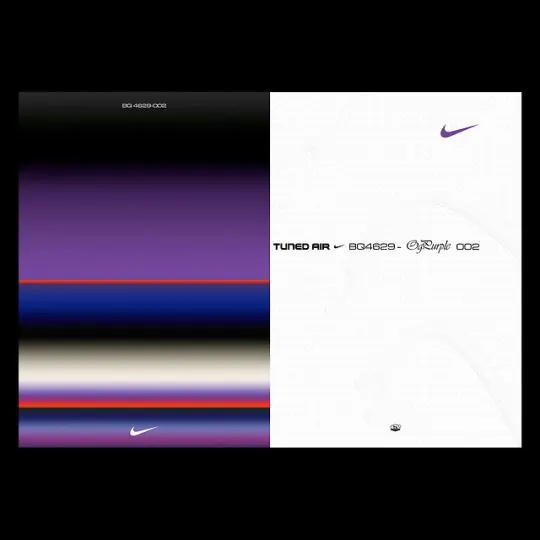
Nike-branded color system showing a vertical spectrum of gradient transitions from deep purple through blue and red-orange tones, paired with clean white-space product branding.
Summary
A Nike sportswear palette exploration presenting a vertical gradient spectrum of rich purples, blues, and warm accents paired with clean white-space product branding and iconic swoosh lockup.
Visual description
The left panel displays a series of horizontal color bands: purple transitioning to dark violet, bright blue, warm red-orange, pale cream, and layered purple gradients, with the Nike swoosh logo integrated into one band. The right panel shows a white background with the Nike swoosh in purple at top, the product name "TUNED AIR" with sub-branding codes and trademark symbols in black sans-serif, and a small Nike wordmark in black at bottom. The entire composition is set against a black background, making the color transitions on the left vibrant and the white space on the right feel expansive.
Key takeaway
The vertical gradient-band layout as a palette-presentation format. The stark left-dark/right-light split creates visual drama and emphasizes the color system. Pairing abstract color exploration with a clean product identity zone clarifies the hierarchy between mood/palette and final branding assets. The inclusion of product codes and legal marks adds credibility and manufacturing realism.
Reuse notes
Ideal for footwear, apparel, or athletic brands developing seasonal color systems. The gradient-band format works for presenting palette evolution or mood progression. Effective when presenting to stakeholders who need to see both the inspirational color story and the final lockup. The white-space clarity on the right grounds the palette in actual usage context.