Preview image. Unlock full-res
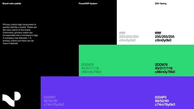
A minimalist brand color system showcasing three primary colors with hex codes and RGB values against a dark background with a simple geometric logo.
Summary
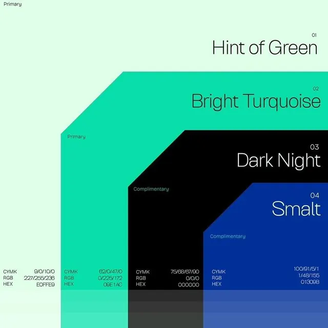
A brand color palette system documenting three primary colors (bright green, indigo purple, and white) with their hex and RGB values presented in a grid layout against black.
Visual description
The composition uses a dark background split into sections by color blocks. The top left area labels the system overview in small white text on black. Three large horizontal color swatches occupy the lower two-thirds: bright neon green (#2DD975), medium purple-indigo (#6335F0), and black, each labeled with hex codes and RGB notation in both light and dark text variants. A simple geometric white logo (appears to be a stylized 'P') sits in the lower left corner, branded as the "PowerGSP System" with "2021 Spring" labeled at top right.
Key takeaway
Documenting a palette with both hex and RGB codes side-by-side ensures technical accessibility across media. Placing labels in multiple colors (light on dark, dark on light) shows the palette's contrast and legibility constraints at a glance. The grid-based layout is clean and scannable, suitable for hand-off to developers or cross-functional teams.
Reuse notes
Strong reference for brand system documentation aimed at technical teams, developers, and designers. Works best when the color count is small (3-5 core colors) and the palette has clear complementary or analogous relationships. Useful in design guideline PDFs, Figma documentation, or development handoff specs. The black background emphasizes the colors while the geometric logo anchors brand identity.