Preview image. Unlock full-res
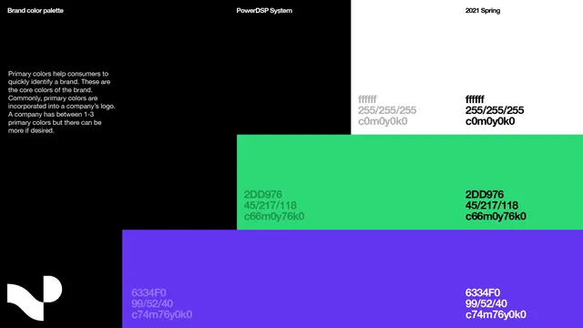
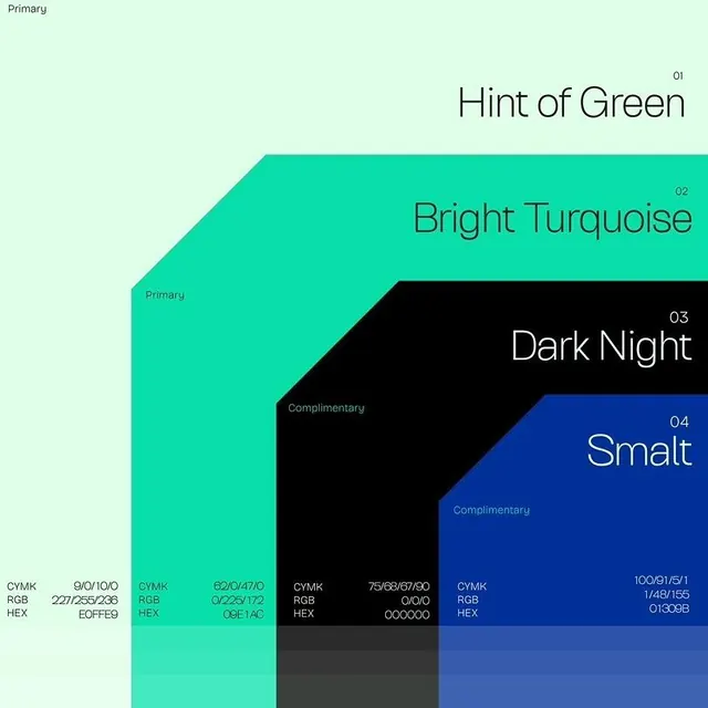
Design system color palette showing four primary colors arranged in overlapping geometric sections with CMYK and RGB values.
Summary
Design-system documentation page displaying a four-color palette (mint, turquoise, black, navy) in overlapping geometric sections with full CMYK/RGB/hex specifications and descriptive names.
Visual description
Vertical layout with pale mint background. Four overlapping parallelogram sections (angled top-left to bottom-right) in sequence: light mint-green labeled "Hint of Green," bright turquoise labeled "Bright Turquoise," black labeled "Dark Night," and navy labeled "Smalt." Each section includes a color name in thin sans-serif at top-right with a number (01-04), and below the entire composition, each color displays technical specs (CMYK values, RGB, and hex code) in small monospace type. "Primary" label in top-left; "Complimentary" notation for black/navy sections. The overlapping creates a sense of depth and systematic precision while maintaining clarity.
Key takeaway
The overlapping angled geometry as a visual device that elevates a technical spec sheet beyond a static swatch grid. The inclusion of both CMYK and RGB with hex forces teams to reference a single source, reducing brand-color drift. The naming convention (descriptive + number) makes color selection easy in conversation without relying on hex memorization. Thin, precise type treatment signals "specification document," building confidence in the system.
Reuse notes
Essential for multi-discipline brand teams (print + digital + web). Best suited for design systems, developer tooling, and brand guidelines where color consistency across platforms is critical. Include this page in handoff documents to avoid "close-enough" color substitution. Works equally well for 2, 4, or 6-color palettes; scales awkwardly above 8 colors. The angled overlap layout requires centered presentation; avoid cramming into tight sidebar templates.