Preview image. Unlock full-res
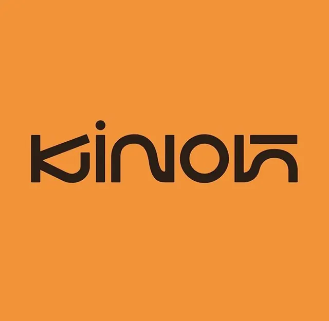
A bold black wordmark with flowing curved letterforms set against a warm burnt orange field, showcasing geometric sans-serif design with distinctive letterform openings.
Summary
A bold black wordmark with flowing curved letterforms set against a warm burnt orange field, showcasing geometric sans-serif design with distinctive letterform openings.
Visual description
The wordmark "Kinfolk" floats centered on a vibrant burnt orange field. Each letter features wide open apertures and gentle curves characteristic of a contemporary geometric sans-serif. The black weight contrasts sharply against the warm background, with a distinctive dot accent above one letter. The overall composition is square and balanced, with ample breathing room around the type. The letterforms have a friendly yet serious character, blending rounded bowl shapes with structured strokes.
Key takeaway
The bold monochromatic contrast on a saturated warm background commands attention without any supporting imagery or pattern. The geometric letterforms with open apertures balance modern precision with approachability. A single accent mark (the dot) adds a custom brand mark flavor without overcomplicating the core wordmark.
Reuse notes
Effective for lifestyle, food, media, or technology brands seeking warmth without playfulness. The orange-on-black palette translates well to packaging, signage, and digital backgrounds. Best suited for square-format applications where the centering is maintained; works less well in horizontal lockups where the dot accent might feel orphaned.
More like this



Keep what you find
A free account saves references to boards and can send you a weekly email of picks based on what you save.
To see every result, go Pro.