Preview image. Unlock full-res
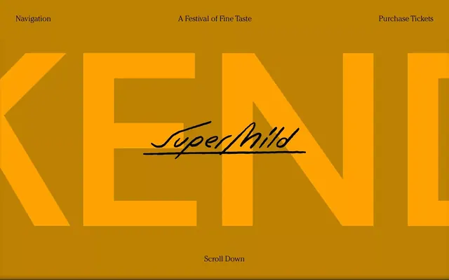
Festival landing page with large layered gold geometric letterforms spelling the event name, offset against warm ochre background with minimalist header and footer.
Summary
Festival event page dominated by overlapping geometric letterforms in bright gold and ochre tones, with minimal supporting navigation and call-to-action at top and bottom.
Visual description
Full-height layout with warm mustard-gold background. At top, navigation anchors left (Navigation) and right (Purchase Tickets), with the event title centered (A Festival of Fine Taste). The main hero features massive, interlocking geometric letters rendered in bright gold (#FEA202) and darker ochre (#BD8202), with semi-transparent layering creating depth and visual rhythm. A flowing handwritten script (SuperMild) cuts diagonally across the geometric forms, adding contrast and personality. At the bottom, white text reads "Scroll Down," encouraging interaction. The overall effect is bold yet refined, mixing corporate geometry with artisanal handwriting.
Key takeaway
The layering technique where geometric shapes overlap and hint at negative space creates visual intrigue without appearing chaotic. The handwritten accent script humanizes otherwise strict geometric letterforms. This color pairing (gold on ochre) reads as premium and foodie-adjacent without requiring photography.
Reuse notes
Ideal for upscale event promotion, food festivals, or fine-dining brand launches. The geometric type demands confident execution; works best when letterforms are very large and the page is text-light. The warm palette works particularly well for events themed around craft, tradition, or luxury. Less suitable for tech, healthcare, or austere corporate identities.
More like this
Keep what you find
A free account saves references to boards and can send you a weekly email of picks based on what you save.
To see every result, go Pro.