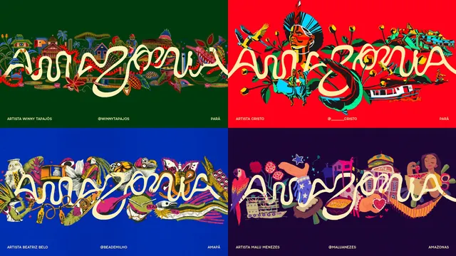
Preview image. Unlock full-res
A four-panel grid showing the same cream looping logotype woven into four saturated illustrations, each credited to a different artist and state.
More like this
See all

Summary
Four artwork panels in a two-by-two grid, each pairing the same cream looping "amazonia" logotype with a different illustrator's dense scene, showing how one fixed mark absorbs wildly different visual languages.
Visual description
The frame divides into four equal panels with no gutters, each on its own flat background: dark forest green (top left), bright red (top right), deep blue (bottom left), and near-black plum (bottom right). In every panel the identical cream monoline logotype runs edge to edge across the middle, and the illustration is built around and through it so plants, animals, boats, and figures pass behind and in front of the loops. The top left panel is a densely patterned line-drawn scene of stilt houses, palms, pottery, and fish. The top right shows a portrait in a feathered headdress with macaws, fish, a river boat, and green foliage in flat neon color. The bottom left mixes cut-paper style collage of gourds, flowers, a snake, a caiman, and packaging fragments. The bottom right uses softer pastel figures, a parrot, a decorated river boat, a colonial facade, and a woman with a fruit bowl. Each panel carries a single bottom rule of small all-caps sans type in three positions: artist name at left, social handle centered, and the Brazilian state at right.
Key takeaway
Holding the logotype completely constant while giving every collaborator full freedom behind it turns a rigid mark into a frame for other people's work. The repeated three-part caption line (name, handle, state) is what keeps four unrelated styles reading as one program rather than four posters.
Reuse notes
Good reference for a brand that needs to represent many places or communities without flattening them, and for any artist-collaboration series where attribution has to be visible but quiet. It only works if the mark is simple and horizontal enough to survive being buried in artwork. The bottom caption rule is doing heavy lifting; drop it and the grid loses its system.
More like this

Keep what you find
A free account saves references to boards and can send you a weekly email of picks based on what you save.
To see every result, go Pro.