Preview image. Unlock full-res
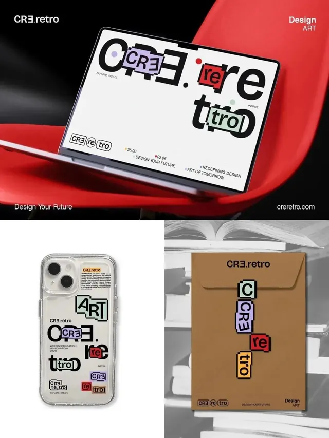
Retro-futuristic type system and logo treatments displayed across digital and physical assets: tablet mockup, phone case, and kraft envelope, featuring layered geometric letterforms in red, purple, and black.
Summary
Retro-futuristic type system and logo treatments displayed across digital and physical assets: tablet mockup, phone case, and kraft envelope, featuring layered geometric letterforms in red, purple, and black.
Visual description
A comprehensive brand application showcase featuring the CRE.retro identity across four contexts. Top image shows the full logo with layered letterforms (letters stacked and offset in red, purple, and black) displayed on a tablet against a red diagonal backdrop, flanked by black header text and "Design ART" signage. Three additional product mockups below demonstrate system consistency: a smartphone case with letter-stacked versions of the logo and supporting text, and a kraft envelope with vertically arranged logo elements. All applications use bold sans-serif sans-serif typography with distinctive 1980s-inflected geometric letterforms. The color palette alternates between warm (red, brown, tan) and cool (purple, gray) tones against white and kraft backgrounds.
Key takeaway
The concept of breaking a logo into stacked, colorized letterforms to create visual rhythm and texture. How the same modular building blocks scale and reorient across different media and formats while maintaining identity. The pairing of 80s-inflected geometric type with contemporary product mockups to signal retro-modern positioning. Systematic application of bold color and layering rules across physical and digital contexts.
Reuse notes
Ideal reference for building modular, stacked type systems or developing retro branding identities with contemporary appeal. The letterform decomposition approach works well for design studios, creative agencies, and tech brands targeting nostalgic audiences. Phase multiple colorway and layering variations to signal versatility in brand systems.
More like this



Keep what you find
A free account saves references to boards and can send you a weekly email of picks based on what you save.
To see every result, go Pro.