Preview image. Unlock full-res
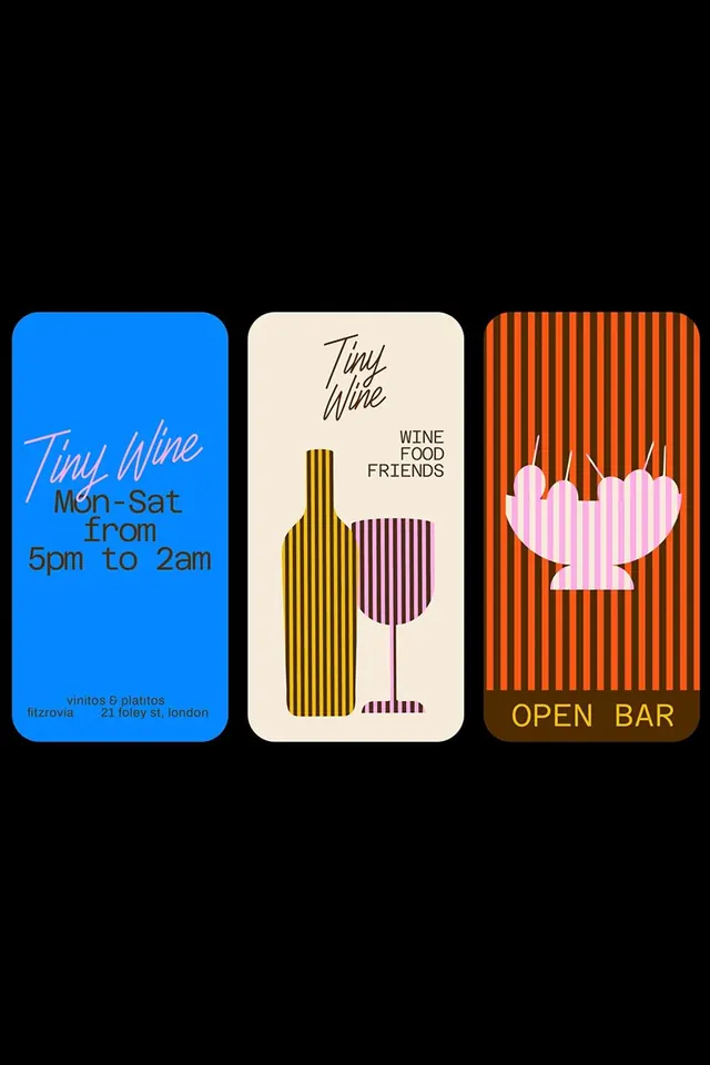
Three stacked wine-bar label cards in complementary colors featuring handwritten script, geometric bottle shapes, and symbolic illustration.
Summary
Wine-bar branding using three vertical cards: bright blue with handwritten script, cream with geometric bottle and glass silhouettes, burnt-orange with striped background and flower shape.
Visual description
Three tall rounded-corner cards arranged horizontally on black. Left card: electric blue background with "Tiny Wine" in flowing script and business info in small sans-serif. Center card: cream field with bottle outline in yellow stripes, wine glass silhouette in burgundy stripes. Right card: burnt-orange with vertical striping and a pink stylized flower/shell shape, text "OPEN BAR" in tan. Colors are highly saturated and complementary. Type mixes script (display) with geometric shapes. Each card is self-contained but cohesive as a system.
Key takeaway
Assigning distinct colors and graphic motifs to each card (bottle, glass, flower) creates visual personality while showing system flexibility. Vertical striping as a texture adds visual interest without complexity. Handwritten script on solid color reads as confident and human against geometric illustrations. The cards work as standalone items or as a coordinated trio.
Reuse notes
Excellent reference for hospitality, wine, or lifestyle brands needing personality. Card format translates well to business cards, menus, or wayfinding. High saturation works for venue branding where distinction and energy matter. Consider similar approach for restaurant, cafe, or retail concepts. The color separation technique helps sub-brands or service categories stand apart visually.
More like this
Keep what you find
A free account saves references to boards and can send you a weekly email of picks based on what you save.
To see every result, go Pro.