Preview image. Unlock full-res
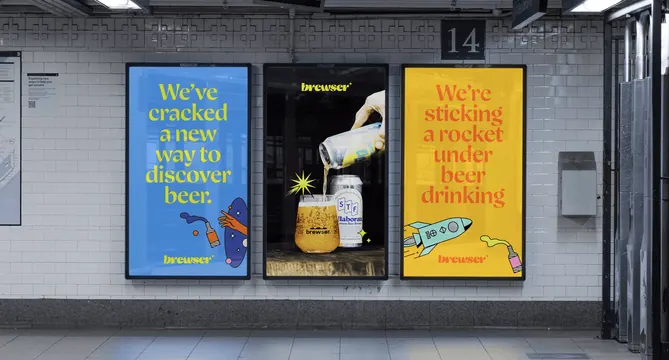
Three digital transit panels on a white-tiled subway wall pairing two big-type colour posters with a dark product photograph in the middle.
More like this
See all
Summary
A three-panel transit run that sandwiches one dark product photograph between two flat colour headline posters, so the set reads as loud, quiet, loud.
Visual description
The photograph shows a white-tiled station wall with a decorative tile frieze along the top, a numbered platform sign, and a granite dado below. Three portrait digital panels in slim black frames hang in a row. The left panel is mid blue with "We've cracked a new way to discover beer." set in five lines of acid yellow high-contrast serif, and in its lower right a line-art bottle tipping into an orange hand inside a dark blue blob. The lowercase wordmark sits centred at the bottom in yellow. The centre panel is near black and photographic: a hand pours from a can into a tapered branded glass of hazy beer, with a second can standing beside it carrying a blue and white collaboration label, a yellow starburst behind the glass and a sparkle at the lower right, with the wordmark small at the top in yellow. The right panel is warm yellow with "We're sticking a rocket under beer drinking" in five lines of orange-red serif, above a mint green line-art rocket and a small bottle in a chartreuse blob, with the wordmark in orange at the bottom. Fluorescent strip lighting and pipework are visible at the top of the frame.
Key takeaway
Alternating flat headline panels with a single dark photographic panel keeps a three-up run from becoming noise, and the black centre panel makes the two colour fields either side look brighter than they are. The same lowercase wordmark anchors each panel in a different position, top or bottom, which keeps the set from feeling like three copies of one template.
Reuse notes
Good reference for a station or corridor run where posters will be seen as a set rather than individually. It assumes control over adjacent placements, so it loses most of its effect if the panels are sold separately. Long five-line headlines in a fine serif work here because commuters are stationary; the same copy would fail on roadside formats.