Preview image. Unlock full-res
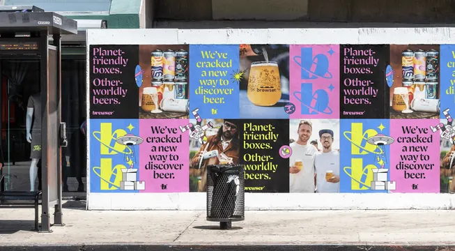
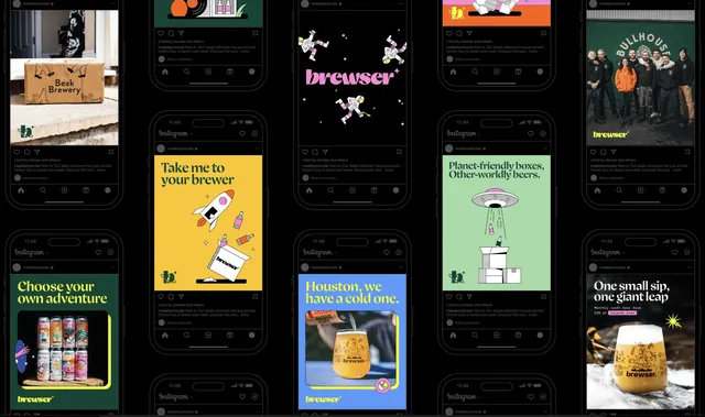
A street wall papered with a repeating grid of Brewser posters that alternates typographic colour blocks, oversized monogram panels and product photography.
More like this
See all

Summary
A pasted-up poster wall that runs the same four poster types in a repeating checker, so the campaign reads as a pattern from across the street rather than as one message.
Visual description
The photograph shows a low white-topped wall on a sunlit pavement, with a bus shelter at the left edge and a mesh litter bin in front. Two rows of posters cover the wall in a tight grid with no gutters. Four artworks repeat and alternate: a black poster with "Planet-friendly boxes. Other-worldly beers." in pink high-contrast serif over a small lowercase wordmark; a blue poster with "We've cracked a new way to discover beer." in acid yellow serif; a solid pink or blue panel carrying an enormous lowercase "b" with an orbit ring and a four-pointed sparkle in the opposing colour; and full-bleed photographs of a can lineup with a filled glass, a hazy beer in a doodle-printed glass, a bearded customer unpacking a box, and two smiling people in branded tees holding beers. Small black line-art stickers sit across the seams: a UFO beaming up bottles, a tumbling astronaut, a stack of boxes, a pointing hand in a blue blob, and a small planet roundel. The palette stays locked to pink, mid blue, acid yellow, black and white throughout.
Key takeaway
Alternating a fixed set of four poster templates turns a flat wall into a pattern, so the identity survives being seen at a glance and from an angle. Letting the line-art doodles straddle the joins between posters stitches the grid into one artwork instead of a row of separate ads. Restricting every panel to the same three brand colours means any poster can sit next to any other without a clash.
Reuse notes
Use this when a campaign has to occupy a large physical surface and you want impact without producing dozens of unique artworks. It relies on high chroma and a very short palette, so it will lose its punch in a muted or single-colour system. The serif headline copy is the weakest element at distance; it works here only because the colour blocks carry the recognition.