Preview image. Unlock full-res
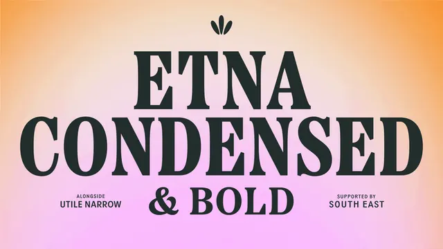
Centred type specimen naming Etna Condensed and Bold in dark serif caps over a peach to pink radial gradient.
More like this
See all
Summary
A centred typeface specimen slide that names the brand's serif in its own letters over a soft peach to pink radial gradient.
Visual description
The background is a smooth radial gradient, warm orange at the corners fading through peach to a pale pink and near white glow behind the centre. A small three-petal leaf mark sits at the top centre in dark green. Below it, the words ETNA on one line and CONDENSED on the next fill nearly the full width in a very large, high contrast serif with sharp bracketed serifs and tight leading, the two lines optically matched so the shorter word is set larger. A third line reads "& BOLD" at roughly half that size, with a swash ampersand. Two small credit lines flank it at the same baseline, each a letter-spaced label above a bold name: "ALONGSIDE / UTILE NARROW" on the left and "SUPPORTED BY / SOUTH EAST" on the right. All type is the same dark near black green, and the composition is symmetrical about the vertical centre.
Key takeaway
Setting the typeface's own name at maximum size and letting the word lengths dictate the scale is the whole layout. The quiet flanking credit lines add the supporting fonts without breaking the symmetry or competing for attention.
Reuse notes
A ready template for the typography page of a brand guideline or case study carousel. Works best with a display serif that has enough character to justify the scale. The gradient keeps a text-only frame from feeling flat, but keep it low contrast so the type stays the subject.
More like this
Keep what you find
A free account saves references to boards and can send you a weekly email of picks based on what you save.
To see every result, go Pro.