Preview image. Unlock full-res
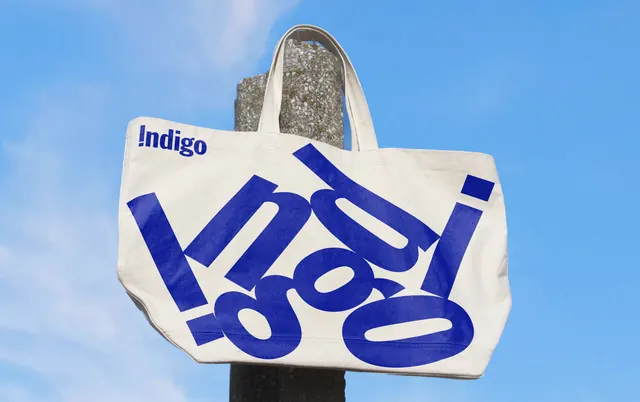
Natural canvas tote bag printed with a hugely oversized blue Indigo wordmark that runs off every edge, shot against a clear sky.
More like this
See all
Summary
A merchandise tote that prints the brand name twice at wildly different scales: a small tidy logo in the corner and a giant cropped version filling the whole bag.
Visual description
A natural undyed canvas tote hangs on a concrete post against a blue sky with light cloud. The small Indigo logo sits at the top left of the bag in royal blue, set in a bold grotesque with the initial I drawn as an exclamation mark. The rest of the face carries the same word blown up far past the edges, tilted a few degrees off horizontal, so only fragments of the letterforms survive: a thick vertical stroke, the counters of the two Os, the bowl of the d, and the isolated square dot of the i near the right edge. The blue ink sits slightly rough on the canvas weave. Handles and bottom seam are left unprinted, and the low camera angle puts the whole bag against open sky with no other props.
Key takeaway
Repeating the same wordmark at two extreme scales on one surface lets the small version do the identification while the large one does the pattern work, with no second graphic asset needed. Cropping the big word past all four edges turns legibility into texture on purpose.
Reuse notes
An easy, cheap merch move for any identity with a strong single-word name and one signature colour. It relies on the wordmark being distinctive in fragments, so it will fail with a generic or thin typeface. One ink on natural canvas keeps the production simple; the same crop would look muddy printed on a coloured or patterned bag.