Preview image. Unlock full-res
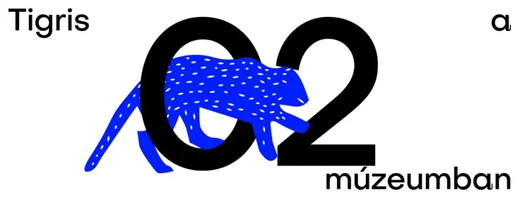
Museum identity for Tigris (year 2) combining a patterned blue tiger silhouette with bold black numerals forming a lock shape, paired with clean sans-serif type.
Summary
Museum identity for Tigris (year 2) combining a patterned blue tiger silhouette with bold black numerals forming a lock shape, paired with clean sans-serif type.
Visual description
The logo merges a blue illustration of a tiger body (filled with white dash marks for texture) with two large black numerals: a 0 and a 2, arranged so they read as concentric circles forming a lock or padlock outline. The word "Tigris" appears in a clean, modern sans-serif on the left in black, while "múzeum" in lowercase sits on the right below the numerals. The composition is tight and symmetrical, relying on strong contrast between the electric blue animal form and the solid black number-lock to convey institutional authority and visual interest simultaneously.
Key takeaway
The clever integration of illustration and typography into a unified mark. The lock formed by the numerals doubles as a visual metaphor for security/preservation, apt for a museum. The texture pattern on the animal (rather than solid fill) adds refinement without complexity.
Reuse notes
Strong for cultural institutions, archives, or any brand that combines animal or nature elements with structured geometric forms. The high-contrast blue-black palette reads distinctly in all sizes. The '0' and '2' lock device works well when the year/sequence matters to the brand story.
More like this
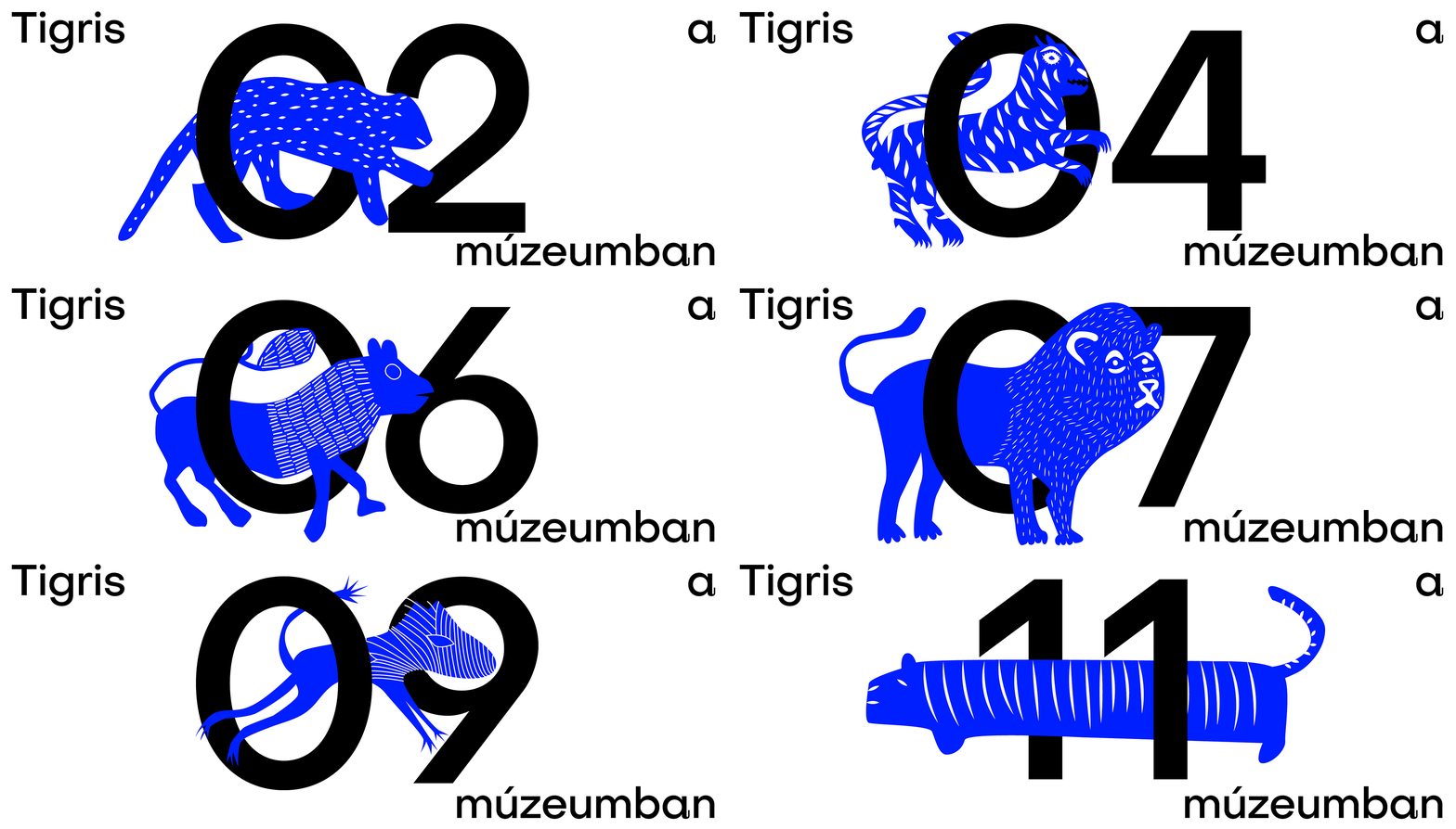


Keep what you find
A free account saves references to boards and can send you a weekly email of picks based on what you save.
To see every result, go Pro.