Preview image. Unlock full-res
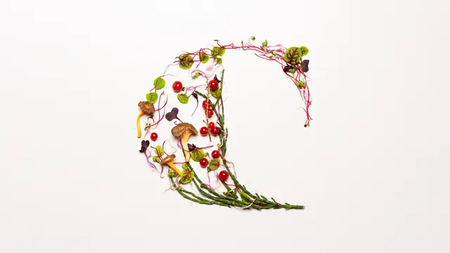
The brand initial formed as a crescent of samphire, microgreens, redcurrants and chanterelles arranged on a white ground.
More like this
See all

Summary
The brand initial rendered once in raw ingredients, a thick crescent of produce that reads as a letter C from a distance and as a still life up close.
Visual description
A wide off-white field with the arrangement placed just right of centre and floated in a large amount of empty space. The form is a heavy crescent, thick at its lower left and tapering to fine points at the top right and bottom right, open toward the right so the counter of the letter is bare paper. It is built from long green samphire stems that give the outer curve its structure, threaded with magenta and white beet stems, round green sorrel leaves with red veining, dark purple shiso, pale bean sprouts and small pea shoots. Bright red currants, some still on the stalk, punctuate the mass, and three ochre chanterelles sit at the lower left where the shape is heaviest. Everything lies flat and is lit softly from above, casting only faint contact shadows, with the ingredients scattered loosely enough that the negative space between them is part of the drawing.
Key takeaway
Letting the product build the logo rather than sit beside it, so the mark is never the same twice and every seasonal shoot regenerates the identity. Keeping the counter of the letter completely empty is what makes a loose pile of vegetables resolve into a legible character.
Reuse notes
Ideal as a campaign or launch image for a food, grocery or wellness brand whose initial has a simple silhouette. It demands very careful styling and a lot of surrounding white space; crowded or cropped tighter, the letterform stops reading. Not a substitute for a drawn mark, so pair it with a fixed logo for small sizes and utility placements.