Preview image. Unlock full-res
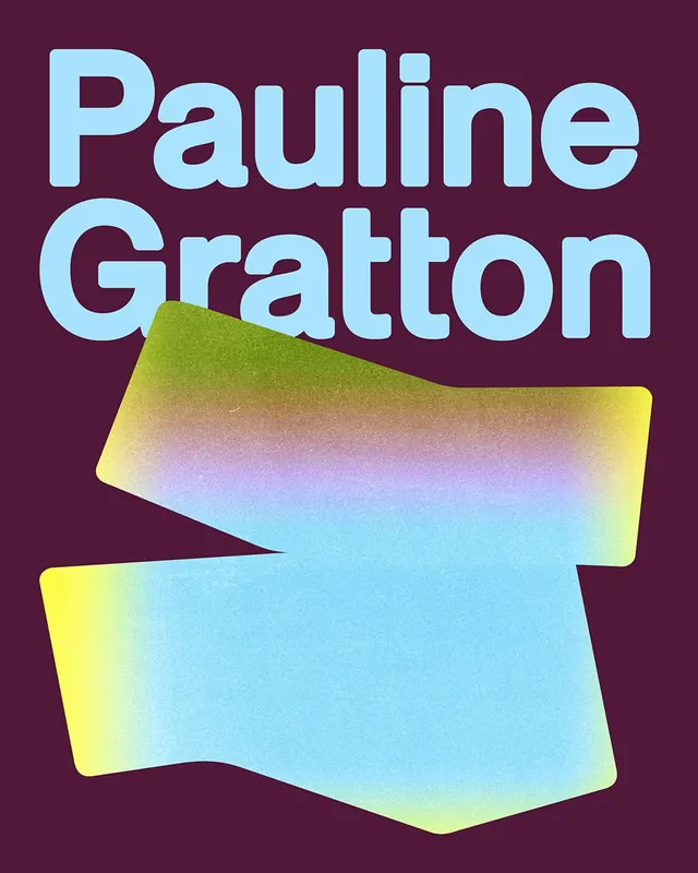
Oversized sans-serif type name stacked and displayed in light cyan against deep plum, with geometric gradient shapes below in lime, yellow, and cyan.
Summary
Oversized sans-serif type name stacked and displayed in light cyan against deep plum, with geometric gradient shapes below in lime, yellow, and cyan.
Visual description
Two lines of display-weight, light-cyan sans-serif text reading "Pauline" and "Gratton" fill the upper two-thirds of a deep plum background. Below the text sit two overlapping, rounded-rectangle shapes with smooth gradients. The upper shape transitions from lime and yellow to light blue; the lower shape gradates from bright yellow to cyan. The gradient shapes are tilted and layered, creating depth and visual rhythm. The typography is clean, bold, and highly legible. The background is solid and matte.
Key takeaway
The pairing of oversized, solid-color type against a matte dark background for maximum legibility, plus the decorative abstract gradient shapes anchoring the composition below. The color contrast (cyan on plum) makes the text sing without distraction. The tilted, overlapping geometry adds personality without disrupting hierarchy.
Reuse notes
Strong template for a type specimen or typographic poster targeting modern, playful brands. Works best when the type is the primary focus and gradient elements are purely decorative. High contrast is essential for legibility.
More like this



Keep what you find
A free account saves references to boards and can send you a weekly email of picks based on what you save.
To see every result, go Pro.