Preview image. Unlock full-res
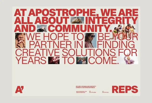
Bold red typography interspersed with photographic snippets on a cream background, establishing a confident brand voice for a community-focused creative services firm.
Summary
A confident design studio brand showcasing large-scale red sans-serif typography overlaid with portrait and lifestyle photography, establishing community and partnership as core values.
Visual description
Cream background with full-bleed composition using a striking cherry-red sans-serif typeface in all caps as the dominant layer. Photography - candid portraits and group shots - is embedded within and around the letterforms, breaking up the text and creating visual rhythm. Primary message "AT APOSTROPHE, WE ARE ALL ABOUT INTEGRITY AND COMMUNITY" anchors the upper half; a secondary block of lighter-weight copy below extends the message. A horizontal band at the bottom in a smaller scale contains the studio logotype (a red "A" mark) and contact information in a muted red and gray palette. The asymmetrical placement of imagery creates dynamic tension against the rigid grid of type.
Key takeaway
The integration of photography as a structural design element, not an ornament. Use living imagery to humanize a corporate message and reinforce brand values like community and partnership. The constraint of embedding only tight crops within and beside text establishes a distinctive, recognizable visual system that works across applications.
Reuse notes
Strong reference for service-based brands (agencies, studios, consulting) that want to emphasize people and relationships. The red-and-cream palette works well for contemporary, culturally conscious brands. Best suited to poster, report, and identity collateral where large-scale typography and generous breathing room can be employed; less suited to compressed layouts or digital surfaces that demand responsiveness.
More like this





Keep what you find
A free account saves references to boards and can send you a weekly email of picks based on what you save.
To see every result, go Pro.