Preview image. Unlock full-res
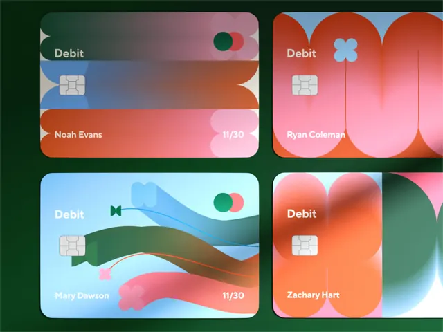
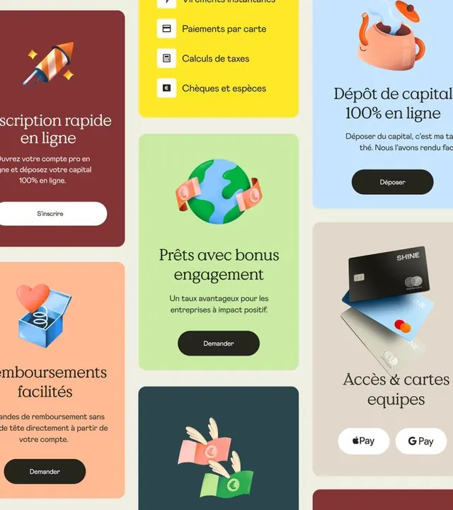
Shine fintech platform UI system featuring playful illustrated icons and soft pastel cards organizing capital investment and payment services.
Summary
Shine is a playful fintech UI system with card-stacked service modules and custom characters, combining soft pastel backgrounds with teal accents and illustrated icons for capital investment and payment services.
Visual description
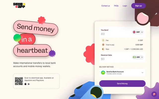
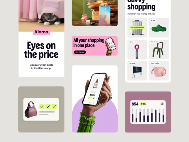
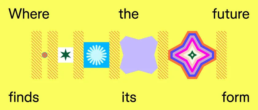
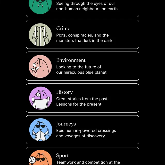
Multi-panel card layout with distinct colored backgrounds, each ~300px square: a maroon panel with a rocket-and-sparkle icon for rapid subscription; a golden-yellow panel showing payment and tax calculation options; a light-green card for a globe-and-currency bonus loan feature; a light-blue card featuring a teapot character and capital deposit headline; a beige-gray panel with credit-card mockups and payment-partner logos. Custom sans-serif type in sentence case anchors each module. Playful anthropomorphic characters (teapot, money waving) appear in 2-3 cards. Consistent rounded-button CTAs, dark-gray text on light backgrounds, and small sparkle/icon accents reinforce a modern-yet-friendly tone.
Key takeaway
The card-based modular approach lets each feature breathe; pastel background palette is warm without being gaudy; custom illustrations (rather than generic UI patterns) create personality and memorability; teal accents punch through pastels and guide hierarchy; the playful character integration humanizes financial services without feeling unprofessional.
Reuse notes
Strong for B2B fintech, investment platforms, or payment UX redesigns targeting millennial users. Works well when you need to make complex financial concepts feel approachable. Avoid if the target audience expects stern/austere banking aesthetics.