Preview image. Unlock full-res
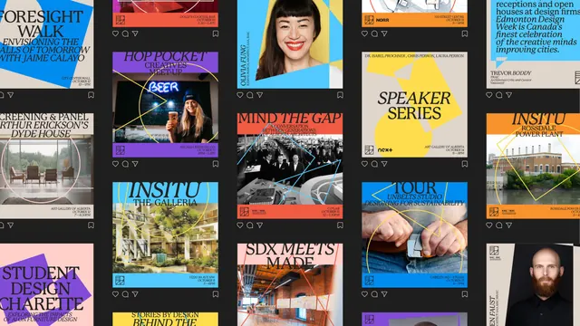
A dark-ground grid of social media event tiles applying the festival identity to speaker portraits, venue photos and typographic announcements.
More like this
See all
Summary
Roughly fifteen square social tiles laid out as a feed on near-black, showing how one festival system stretches across typographic announcements, cropped portraits and venue photography.
Visual description
Five columns of square posts on a charcoal background, each with the small like, comment and share icons beneath it so the layout reads as a social feed. The tiles alternate between three treatments. Type-only tiles set an event title in a high-contrast serif, caps with italic subtitles, over flat shape groups: "FORESIGHT WALK" in stone and blue, "STUDENT DESIGN CHARETTE" in pink and purple, "SPEAKER SERIES" in stone and yellow. Photo tiles crop an image tight and lay thin single-weight line shapes over it, a yellow circle-and-triangle outline over the "HOP POCKET" bar photo, a blue polygon over the black and white archive shot on "MIND THE GAP", a yellow arc over the Rossdale Power Plant. Portrait tiles knock a speaker out against a flat colour field with their name set vertically down the left edge in caps and italics. Every tile carries a coloured footer bar holding the square monogram, the venue and a date and time in caps and italic, with partner marks such as RAIC and NORR where relevant. The palette repeats across the grid: cyan, yellow, orange, purple, red, pink and warm stone.
Key takeaway
A fixed coloured footer bar carrying monogram, venue and time is what makes fifteen very different tiles read as one account. Overlaying thin outline geometry on photography brands the image without covering it.
Reuse notes
Strong template for conference, festival or programme announcements that mix speakers, venues and sessions. Shown as a full feed, so it is most useful when judging rhythm across posts rather than a single tile. The vertical name setting on portrait cards is attractive but slow to read on a phone, so keep it to short names.
More like this

Keep what you find
A free account saves references to boards and can send you a weekly email of picks based on what you save.
To see every result, go Pro.