Preview image. Unlock full-res
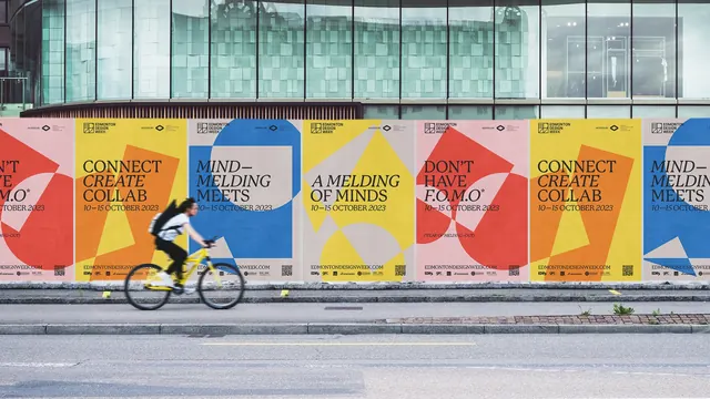
A long street hoarding tiled with repeating Edmonton Design Week posters in red, yellow, blue and stone, with a cyclist blurring past.
More like this
See all
Summary
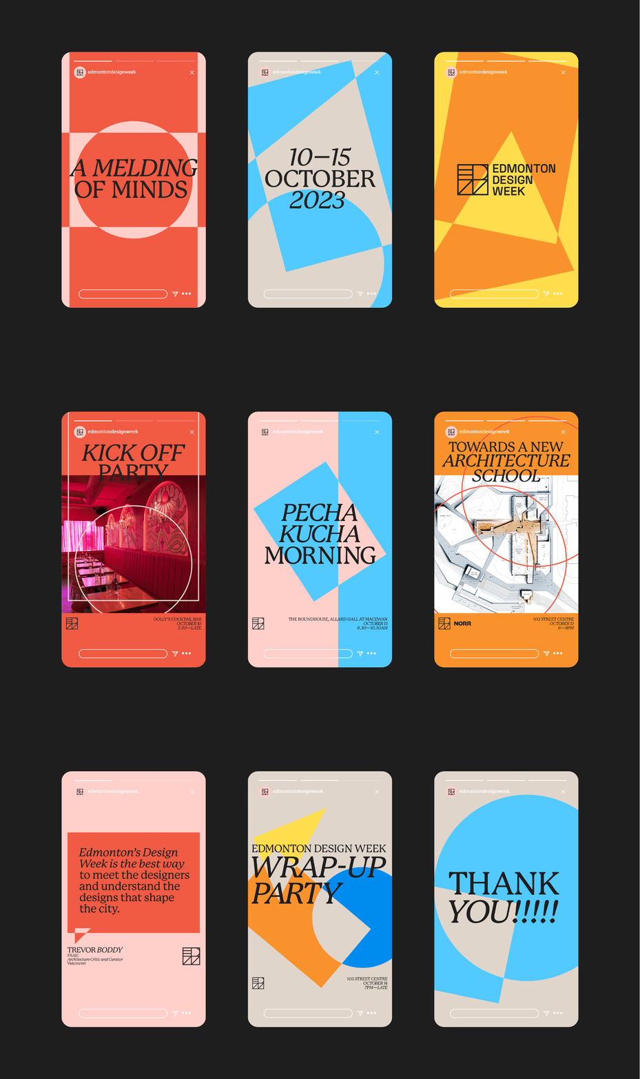
Six poster designs pasted in a repeating run along a construction hoarding, each a different colour pairing of the same shape-and-serif system for a design festival.
Visual description
Shot straight on from across the road. Above the hoarding is a curved glass and metal facade with a slatted wood soffit; below it a granite kerb and asphalt. The poster band runs the full width in portrait panels: red on pink, orange on yellow, blue on stone, yellow on stone, red on pink, orange on yellow, blue again. Each poster carries the Edmonton Design Week square monogram at the top left, a small "HOSTED BY" credit with the Media Architecture Design Edmonton mark at the top right, a large flat geometric shape group behind the type (circles, quadrilaterals and cropped triangles), a headline in a high-contrast serif set in caps with selected words in italic ("CONNECT CREATE COLLAB", "MIND MELDING MEETS", "A MELDING OF MINDS", "DON'T HAVE F.O.M.O"), the dates "10 to 15 OCTOBER 2023" underneath, and a footer strip with edmontondesignweek.com, a QR code and a row of small sponsor logos. A cyclist on a yellow frame crosses the lower left, blurred by the exposure.
Key takeaway
Building each poster from the same three parts (one background colour, one shape group, one caps-and-italic serif headline) lets the wall repeat without looking like one poster printed six times. The italic word inside an otherwise upright caps headline is the whole voice of the identity.
Reuse notes
Reference for festival and cultural identity systems that need to fill long runs of street furniture. The tiling only works because the four colourways sit at similar value; introducing a much darker panel would break the rhythm. QR and sponsor rows are relegated to a fixed footer band, which is a clean way to absorb partner requirements.