Preview image. Unlock full-res
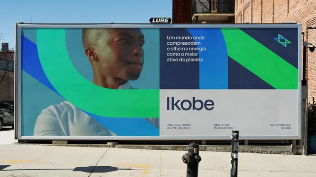
Billboard for Ikobe energy brand featuring a portrait photograph overlaid with curved geometric color panels in blue and green, with a sans-serif wordmark.
Summary
Billboard for Ikobe energy brand featuring a portrait photograph overlaid with curved geometric color panels in blue and green, with a sans-serif wordmark.
Visual description
Large outdoor billboard showing a portrait of a man in profile against layered curved panels in teals, blues, and greens that flow diagonally across the composition. The photograph sits left-aligned; the color panels sweep upward and rightward, creating dynamic directional movement. White and light gray text in Portuguese appears in the upper right panel area, describing the energy concept. The Ikobe wordmark in dark sans-serif sits centered at the bottom of the composition in front of a light gray strip. A small geometric symbol (concentric circles or similar) appears in the upper right. The overall layout balances the human element (photograph) with abstract geometric motion (curved color blocks), conveying both approachability and forward momentum.
Key takeaway
The curved color panels acting as both aesthetic and directional elements, guiding the viewer's eye through the composition without being decorative. The technique of layering abstract geometry over photography creates depth and visual interest while maintaining corporate clarity. The cool blue-green palette reads as both modern and trustworthy in an energy/sustainability context.
Reuse notes
Effective for B2B or energy-sector brands aiming to communicate both human impact and technological progress. The curved panels technique works well at large scale (billboards, banners). Consider how text legibility can suffer when overlaid on colored panels, especially in outdoor conditions. The geometric mark could be extracted as a standalone brand element for smaller applications.
More like this



Keep what you find
A free account saves references to boards and can send you a weekly email of picks based on what you save.
To see every result, go Pro.