Preview image. Unlock full-res
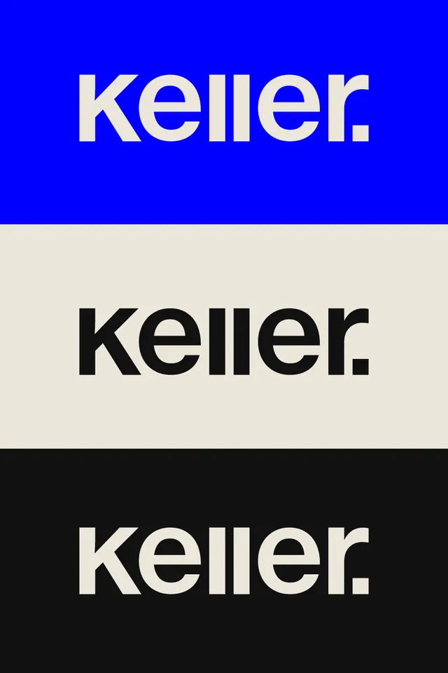
Three-color branding system for Keller showing the same geometric sans-serif wordmark in white-on-blue, black-on-cream, and white-on-black horizontal bands.
Summary
Three-color branding system for Keller showing the same geometric sans-serif wordmark applied across royal blue, cream, and black backgrounds as equal horizontal bands.
Visual description
Three stacked, equal-height horizontal bands displaying the identical wordmark 'keller.' with rounded terminals. Top band: pure royal blue background with white, slightly condensed letters. Middle band: warm cream or off-white background with black letterforms. Bottom band: near-black background with white letterforms. The typeface is geometric and bold, with open counters and consistent stroke weight. No additional elements, logos, or decoration, just the wordmark in high contrast against each color to demonstrate versatility and application across the brand color palette.
Key takeaway
The horizontal stacking format efficiently shows how a mark works across brand colors in one composition; the consistent typeface and scale reinforce identity coherence; the bold geometric sans-serif with rounded terminals is friendly yet professional and works at any size.
Reuse notes
Works well for corporate identities, fintech, or tech companies needing to demonstrate versatility across backgrounds. The cream middle band softens the stark black-and-blue contrast and adds a premium neutral option. Best for brands that need to function across multiple contexts; the simplicity makes it scalable for small marks or large signage.
More like this





Keep what you find
A free account saves references to boards and can send you a weekly email of picks based on what you save.
To see every result, go Pro.