Preview image. Unlock full-res
Product shot of a tilted multi-serve juice bottle floating over huge cropped campaign type in white and red on yellow.
More like this
See all
Summary
A large ginger-shot bottle tilted across the frame while the words WAKE, SHAKE and BOOM run behind it at a scale far larger than the pack, cropped by every edge.
Visual description
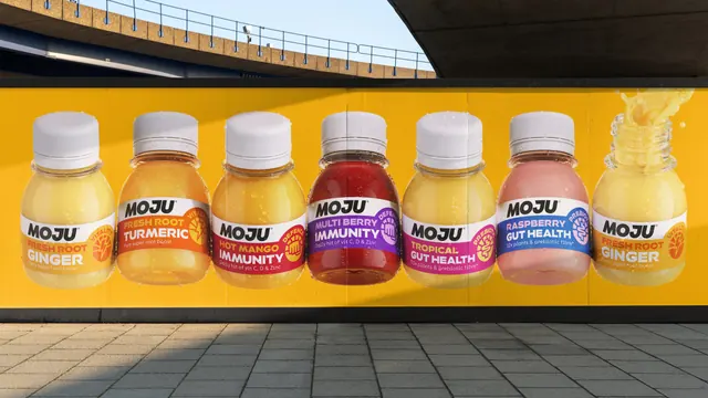
The ground is saturated marigold yellow. Three lines of extremely heavy condensed all-caps sit stacked and cropped: WAKE and SHAKE in white across the top two thirds, BOOM in deep red-orange at the bottom, all so oversized that only parts of each word are visible. In front, angled roughly thirty degrees from vertical, sits a tall clear plastic bottle of cloudy pale yellow juice, condensation beading on the surface and the brand name embossed vertically down the empty right side of the bottle. A white cap tops it, with a small yellow neck tag reading "7x DAILY SHOTS". The front label is a rounded white panel carrying MOJU in a heavy, slightly slanted black sans with a registered mark, then "FRESH ROOT" in red small caps set on a slight arc, then "GINGER SHOTS" in huge white condensed caps over an amber-to-orange gradient, then a red footer band with "FIERY SUPER ROOT BOOST" and "13.8g fresh ginger root per shot". Overlapping the label's right edge is a circular badge with a radiating sun motif, a lightning bolt at its centre and "VITALITY" curved around the ring. A soft white highlight falls diagonally behind the bottle on the right.
Key takeaway
Letting the campaign line outgrow the pack by several times, then cropping it without apology, gives a small bottle the presence of a poster. The label itself is a strict four-tier hierarchy (brand, variant qualifier, product, proof point) that stays legible even when only half the pack is in frame.
Reuse notes
A good reference for functional food and drink where a range needs shelf shout and a repeatable range badge. The approach depends on a short, punchy campaign line of three or fewer words and on a pack whose label already reads at a glance; against a longer strapline the cropping stops being legible.