Preview image. Unlock full-res
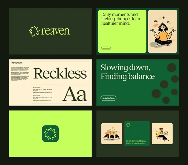
Comprehensive wellness brand system for Reaven, pairing a dotted-circle logo mark with lime-green and forest-green supporting elements, hand-illustrated icons, and serif display type.
Summary
Comprehensive wellness brand system for Reaven, pairing a dotted-circle logo mark with lime-green and forest-green supporting elements, hand-illustrated icons, and serif display type.
Visual description
A six-panel brand presentation showing the Reaven system: top-left wordmark (lowercase "reaven" in a geometric sans-serif above a dotted circular icon in lime-green on forest-green); top-middle a lime-green promotional card with white serif type ("Daily moments and lifelong changes for a healthier mind") and an illustration of a woman meditating in warm tones; top-right an illustration in the same hand-drawn style; middle-left a cream-background panel showing the typeface "Reckless" in a tall, elegant serif with a character set; middle-right a forest-green band with white serif type and ornamental circles; bottom-left a lime-green square containing the mark in a rounded green box; bottom-right a forest-green panel with three small illustrated cards showing people in wellness scenarios. The color system anchors on forest-green and lime-green with off-white and warm accent tones. The serif "Reckless" is distinctive and commands authority.
Key takeaway
The dotted-circle mark is simple, memorable, and works at any scale. The two-color (green) system provides depth and flexibility: lime for action/call-outs, forest for structure/trust. The serif typeface choice for headlines creates upmarket, premium positioning while the illustrated human figures keep it approachable and warm. The consistent use of rounded corners on the app cards softens the geometry.
Reuse notes
Excellent template for wellness, mental-health, fitness, or coaching brands. The illustrated figures are crucial to the brand's friendliness; omit them and it reads as cold corporate. The lime-green is eye-catching on web/mobile but may tire in print; use it sparingly in materials. The serif Reckless is a bold choice that signals premium positioning; a safer substitute would be a classic text serif.
More like this



Keep what you find
A free account saves references to boards and can send you a weekly email of picks based on what you save.
To see every result, go Pro.