Preview image. Unlock full-res
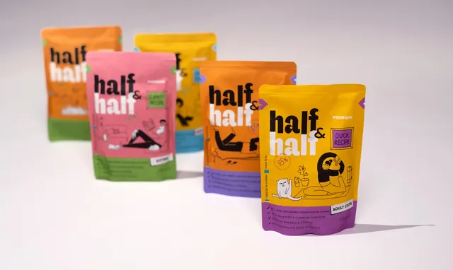
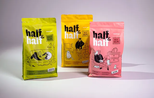
Three colour-coded stand-up cat food pouches lined up on a grey sweep, each carrying the two-tone stacked wordmark and a line-drawn scene of a person with cats.
More like this
See all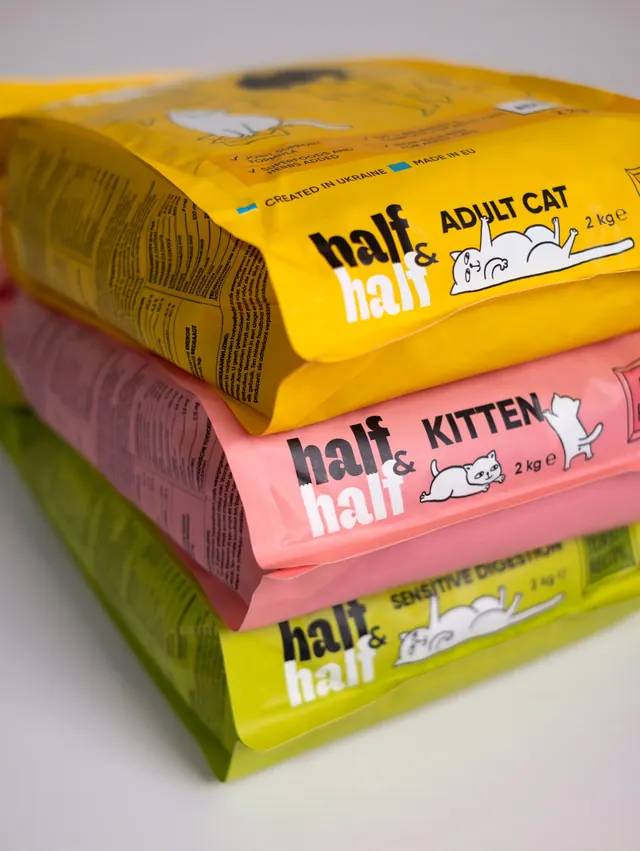
Summary
A three-pack lineup showing how one packaging system flexes across recipes, with flavour split by flat colour and everything else held constant.
Visual description
Three two kilogram stand-up pouches stand upright on a pale grey studio sweep, staggered slightly in depth so the middle one sits back. Left is acid lime for Turkey Recipe, centre is warm yellow for Beef Recipe, right is coral pink for Beef Recipe kitten. Each front repeats the same architecture. Top left carries the stacked wordmark, half in black on the upper line and half in white on the lower line, split by a torn seam with a small black ampersand tucked at the right. The word PREMIUM sits in small caps top right, and a hand-drawn rectangular badge names the recipe below it. The lower two thirds hold a black line illustration of a person and their cats, reading on a sofa, standing by an armchair, and lying on a bench, drawn in a loose single weight with black-filled clothing and white cats. A tinted strip across the base lists four ticked benefit lines, the weight, and a white life-stage tab reading Sensitive Digestion, Adult Cat or Kitten, with a small Created in Ukraine and Made in EU line beneath.
Key takeaway
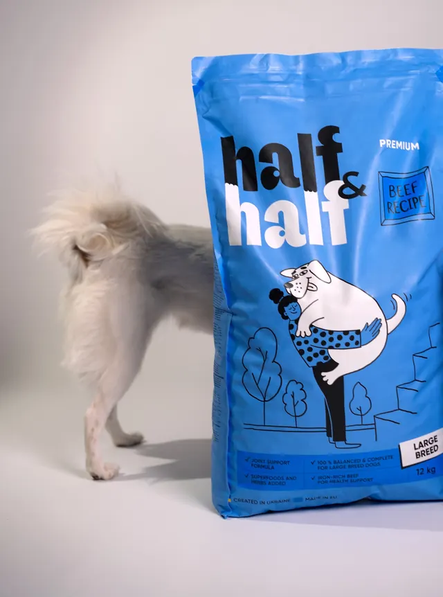
Holding the layout, illustration weight and type identical while changing only the background hue makes the range legible as one family from across a shelf, and lets a new recipe join with nothing more than a new colour and a new scene.
Reuse notes
A dependable template for any variant-heavy consumer range that has to communicate life stage and formula on a soft pouch. The two-tone wordmark needs a mid-value background to keep both halves visible, so very dark or very pale pack colours will break it.