Preview image. Unlock full-res
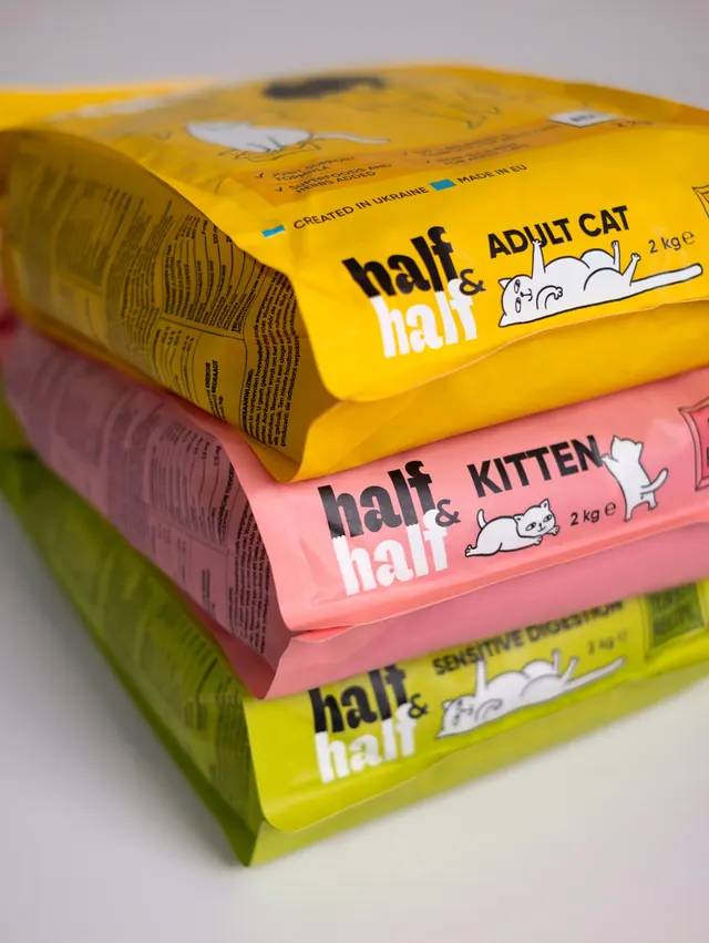
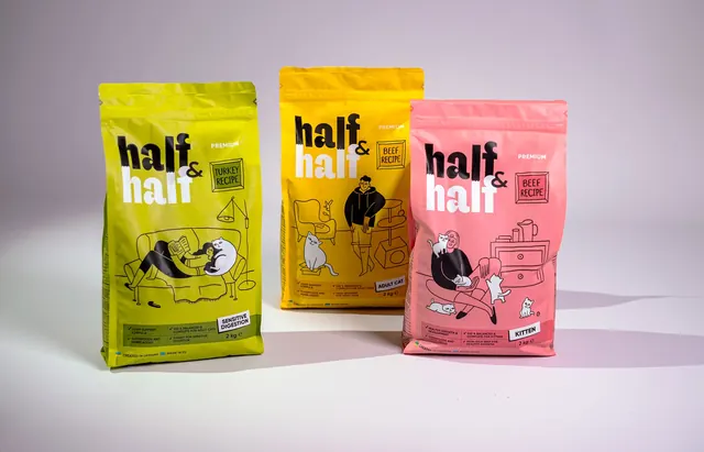
Five stand-up pet food pouches photographed as a range, each a different flavour colour with a chunky black-and-white wordmark and line-drawn cat scenes.
More like this
See all
Summary
Five flavour variants of a cat food pouch staggered in depth on a plain off-white sweep, each split into a saturated upper field and a contrasting colour band along the base.
Visual description
The pouches sit in a loose diagonal cluster, sharpest at the front right and falling out of focus toward the back left. Colours run pink, orange, yellow and back to orange, with each pouch grounded by a bottom band in a clashing hue: green under the pink and orange packs, purple under the yellow and orange ones, plus a small blue tab visible on the rear yellow pack. The wordmark stacks "half" over "half" in a heavy rounded sans, the top word solid black and the lower word knocked out in white, joined by an oversized black ampersand set in the gap between them. A small "PREMIUM" label sits at the upper right, and an outlined box beside the wordmark carries the flavour, "DUCK RECIPE" on the yellow pack and "TURKEY RECIPE" on the pink one. Below sits a black line drawing of a person lounging with a cat, a potted plant and a scratching post, drawn in a single loose weight with no fill. A circular stamp reads "95%". The base band carries four ticked claim lines in small caps, a black "ADULT CATS" chip and the weight, "100 g". Vertical microcopy runs up the pouch edges, including "CREATED IN UKRAINE" with a small flag.
Key takeaway
The two-tone split does all the range work: one colour identifies the flavour, a second unrelated colour at the base keeps every pack loud without the family turning into a rainbow of near-identical layouts. Splitting the wordmark into black and knocked-out white halves makes the name itself demonstrate its own meaning.
Reuse notes
A good reference for range architecture in FMCG where flavour count is high and shelf space is small, especially for pet, snack or kids categories that want warmth without cuteness. The loose line illustration keeps the loud colour from feeling corporate. Note that the claim copy in the base band is set very small and disappears at thumbnail size, so the colour split has to carry recognition on its own.