Preview image. Unlock full-res
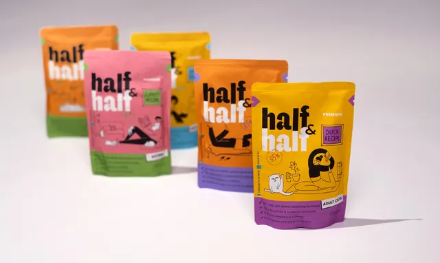
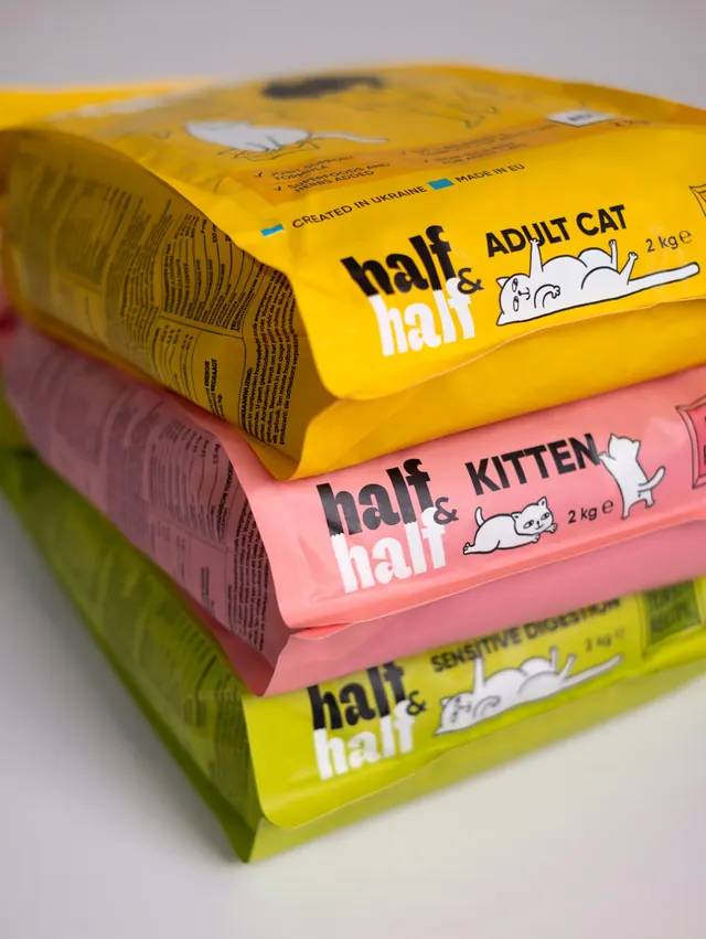
Three cat food pouches lie stacked flat in a close crop, showing the base tabs, cat line drawings and nutrition panel of the range.
More like this
See all
Summary
A tight, angled stack of three flavour variants that puts the base band of each pouch at eye level, so the range reads as colour bars with cat drawings on them.
Visual description
Four pouches lie flat in a low pile on a white surface, shot from close and low so they recede sharply to the upper left. A yellow pack at the top of the frame is turned face down, showing its benefit ticks and a Created in Ukraine and Made in EU line beside small flag blocks. Below it, three packs present their lower front panels in order, yellow marked ADULT CAT, coral pink marked KITTEN, and acid lime marked SENSITIVE DIGESTION. Each band carries the two-tone stacked wordmark at the left, the life-stage name in heavy black all-caps beside it, a weight of 2 kg, and a white line drawing of a cat, one sprawled on its back, one stretched out, one mid-pounce at the edge. Along the left, the printed side gussets show dense multilingual nutrition tables and analytical values in tiny black type. Lighting is soft and even, and the plastic film catches a low sheen along each fold.
Key takeaway
Designing the bottom band as a self-contained lockup means the pack still sells itself when stacked, tilted or shelved in a pile, which is how bagged food actually sits in stores and cupboards.
Reuse notes
A useful photographic angle when a client needs to show range depth without a flat lineup shot. It only works if the secondary panel carries real hierarchy, and the dense side-gusset legal type will look like noise in any crop that does not keep it out of focus.