Preview image. Unlock full-res
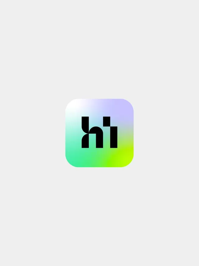
App icon showing a black geometric "hi" monogram on a lavender-to-lime mesh gradient rounded square, centered on light grey.
More like this
See all

Summary
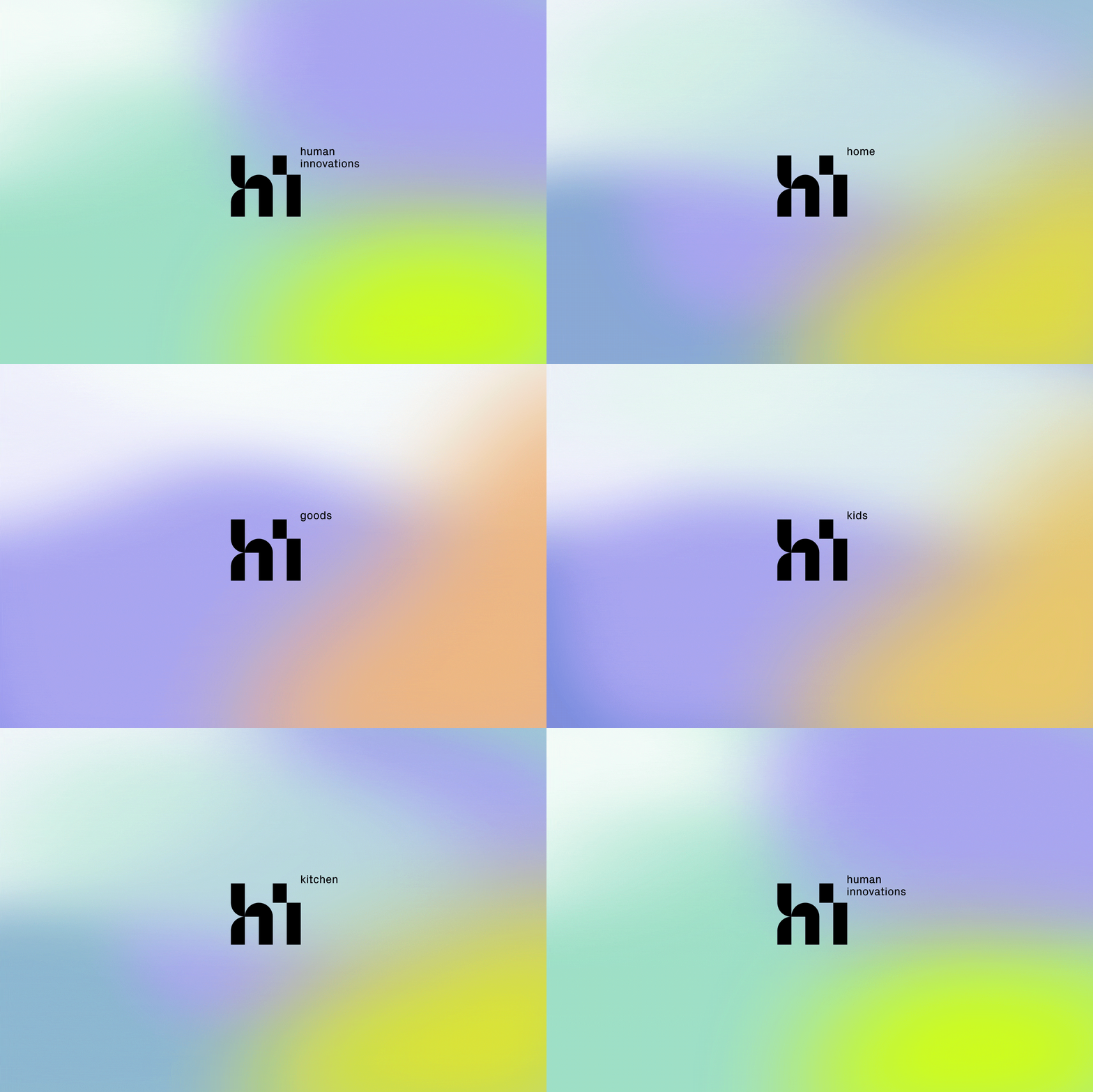
A single app icon presented in isolation: a rounded-square tile filled with a soft multi-stop gradient, carrying a solid black lowercase "hi" monogram built from geometric modules.
Visual description
The frame is a tall light grey field with the icon sitting centered and small, occupying roughly a third of the width. The tile has a generous corner radius in the current iOS style. Its fill is a smooth mesh gradient that runs from a pale near-white at the top left through lavender at the top right, into mint green at the bottom left and a sharp acid lime at the bottom right. The monogram sits dead center in flat black: the "h" is drawn as a vertical bar with a quarter-circle shoulder joining a second bar, and the "i" is a rectangular stem with a detached square tittle. Stroke weights are heavy and uniform, and the counters are squared rather than rounded, so the letterforms read as modular blocks rather than as a typeface. There is no other copy, frame, shadow, or device around the icon.
Key takeaway
Building the monogram from a single quarter-circle-plus-rectangle module keeps the mark legible at icon scale while still reading as custom lettering. Pairing that hard black geometry with a soft four-way gradient lets one asset carry the whole brand personality: structured but not cold.
Reuse notes
A clean reference for presenting an app icon as a standalone identity artifact, with lots of surrounding air rather than a device or home-screen mockup. The gradient does the heavy lifting, so it needs enough tile area to breathe and will lose its range if scaled down to a favicon. Pairs well with a neutral light UI and a plain geometric sans for supporting copy.