Preview image. Unlock full-res
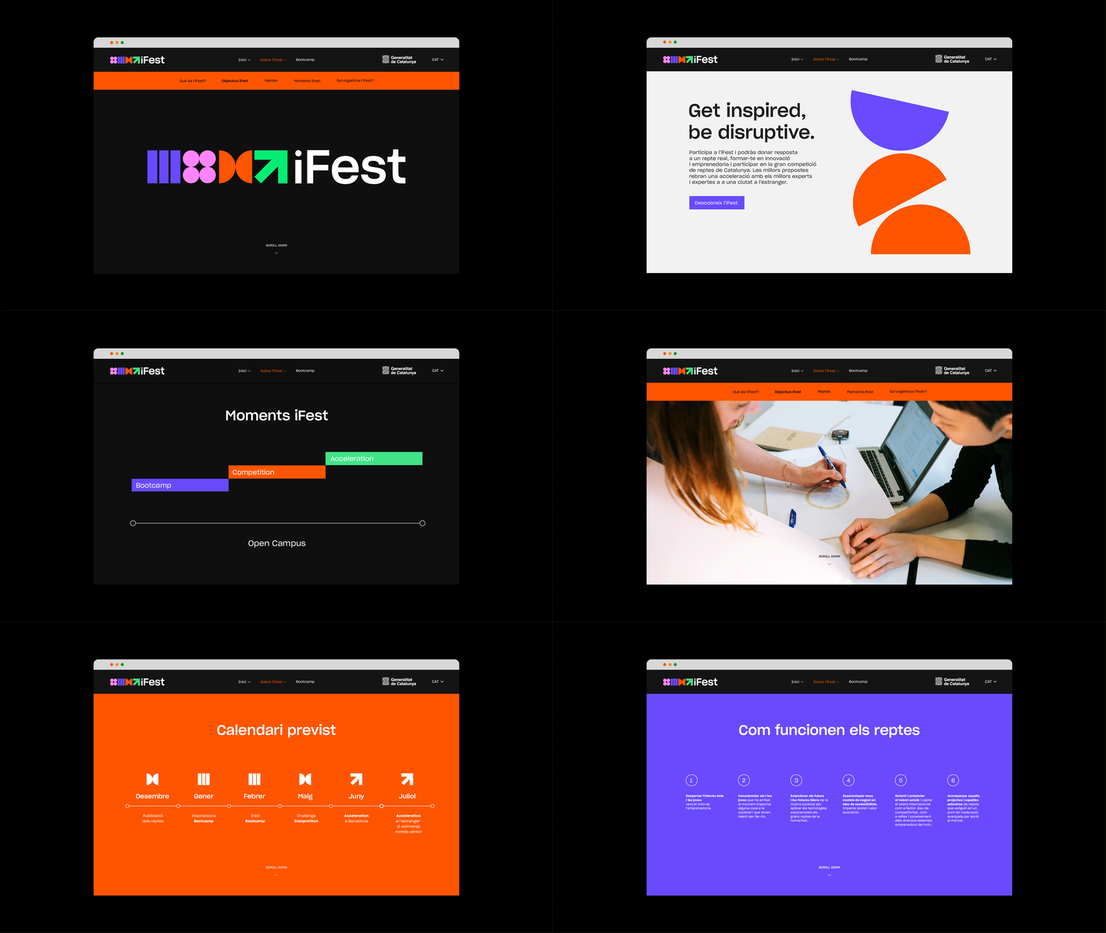
Animated walkthrough of iFest website screens in a browser window, each page committing to one flat brand colour.
More like this
See all
Summary
A browser window cycling through seven iFest website screens, each one a full-bleed block of a single brand colour with the same geometric glyph kit doing the heavy lifting.
Visual description
A generic browser chrome with three traffic-light dots frames every screen against a black backdrop. The persistent top bar carries a small multicolour glyph strip next to "iFest" on the left, a short menu, an institutional logo on the right and a language selector. The screens run: a black page holding the large iFest lockup, a row of pink, violet, orange and green striped blocks and arrow shapes followed by "iFest" in heavy white sans; a near-white page with the two-line headline "Get inspired, be disruptive." over Catalan body copy and a small violet button, with a violet half-disc and stacked orange semicircles filling the right half; a black page titled "Moments iFest" with a horizontal rail carrying staggered violet "Bootcamp", orange "Competition" and green "Acceleration" bars and "Open Campus" below; a mint-green page of three narrow columns of small dark body copy under "Com funcionen els reptes"; a full-width photograph of two people writing at a table with a laptop, under an orange sub-nav; an orange page titled "Calendari previst" with six white geometric icons over month labels on a dashed rail; and a violet page repeating "Com funcionen els reptes" as six numbered short items in a row.
Key takeaway
The identity is a tiny kit of flat geometric parts, striped blocks, wedges and arrows, and those same parts become the page furniture: timeline markers, calendar icons, decorative half-discs. Each screen holds one saturated colour edge to edge, so the sequence reads as a colour system being demonstrated rather than a set of unrelated pages.
Reuse notes
Strong reference for festival, programme or public-sector identities that need to stay recognisable across many differently coloured pages. The browser chrome is neutral enough to reuse as a presentation device. The type is all set small apart from the headline, so this works better as a system demonstration than as a single hero frame.
More like this

Keep what you find
A free account saves references to boards and can send you a weekly email of picks based on what you save.
To see every result, go Pro.