Preview image. Unlock full-res
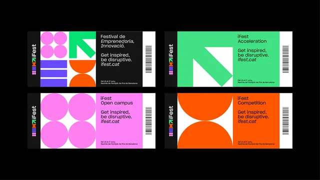
Four festival tickets arranged two by two on black, each combining a vertical logo spine, a modular shape panel and a barcode stub.
More like this
See all
Summary
Four ticket designs shown flat in a two by two grid, sharing one three-panel structure while each uses a different color and a different arrangement of the brand's geometric modules.
Visual description
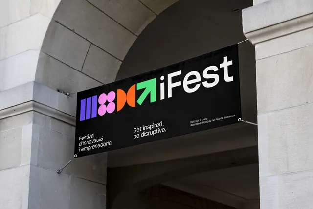
The background is solid black. Each ticket is a wide landscape rectangle split into three vertical zones. On the left, a narrow charcoal spine carries the logo rotated ninety degrees, the four colored modules stacked above "iFest". In the middle sits a large graphic panel built from oversized versions of those same modules: pink circles in a two by two cluster, a green diagonal arrow cut from a white square, violet horizontal bars, and orange half-discs meeting at their flat edges. On the right, a color field holds the copy, then a white stub with a vertical barcode closes the ticket. The top left ticket runs black behind its copy and reads "Festival de Emprenedoria, Innovació." in a mix of roman and italic, followed by "Get inspired, be disruptive." and the italic url "ifest.cat". The other three name their tiers, iFest Acceleration on green, iFest Open campus on pink, iFest Competition on orange. Every ticket closes with two small lines of venue detail, "Del 13 al 17 Juny." and "Recinte de Montjuïc de Fira de Barcelona".
Key takeaway
The graphic panel is where the variation happens: the layout, the spine and the copy block never move, but each ticket gets its own oversized crop of a different module. That gives four visibly distinct artifacts from one grid and one shape library.
Reuse notes
A strong reference for a print collateral family that needs to feel designed rather than templated, and for identities built on a small set of reusable shapes. The rotated logo spine is a neat way to keep the mark present without spending horizontal room. Requires copy short enough to sit in a narrow right column, and a palette where black type stays readable on every fill.
More like this
Keep what you find
A free account saves references to boards and can send you a weekly email of picks based on what you save.
To see every result, go Pro.