Preview image. Unlock full-res
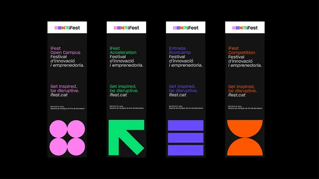
Four tall black access passes in a row, each headed by the logo on white and closed by an oversized colored shape at the foot.
More like this
See all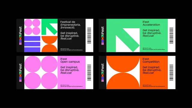
Summary
A four-up comparison of tall vertical passes, each following the same top to bottom rhythm of white logo header, black copy field and a single oversized color shape anchoring the base.
Visual description
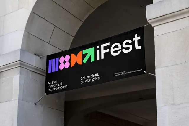
Four narrow portrait cards stand side by side on a black background, evenly spaced and aligned along the same top and bottom edges. Each begins with a white band holding the full horizontal logo lockup, the four colored modules followed by "iFest" in bold rounded sans. Below that the card is near black. The tier name sits at the top in the card's accent color across two lines, followed by "Festival d'innovació i emprenedoria." in white, with the second line in italic. A large gap separates that from the tagline "Get inspired, be disruptive." set in the accent color, with the italic url "ifest.cat" in white beneath. Two lines of small grey venue copy follow. The bottom quarter of each card is filled by one oversized module in the accent color: four pink circles for Open Campus, a green diagonal arrow for Acceleration, three violet horizontal bars for Entrada Bootcamp, and two orange half-discs meeting point to point for Competition. The shapes are cropped by the card edges.
Key takeaway
Reserving the bottom quarter of the card for a single enormous shape gives each tier an instantly recognizable silhouette, readable from across a room even when the type is not. Setting the tier name and tagline in the accent color while the body copy stays white keeps the hierarchy doing double duty as color coding.
Reuse notes
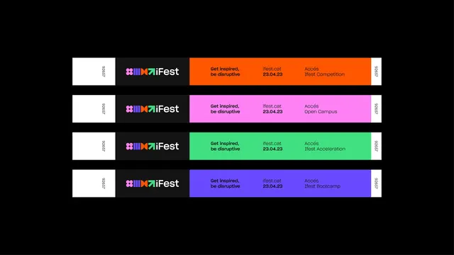
Useful for lanyard passes, program cards or any vertical print piece that has to work as both a wayfinding token and an information carrier. The layout has a large deliberate gap in the middle, so it needs restrained copy and will not absorb extra paragraphs. Pairs directly with the same system's tickets and wristbands.
More like this


Keep what you find
A free account saves references to boards and can send you a weekly email of picks based on what you save.
To see every result, go Pro.