Preview image. Unlock full-res
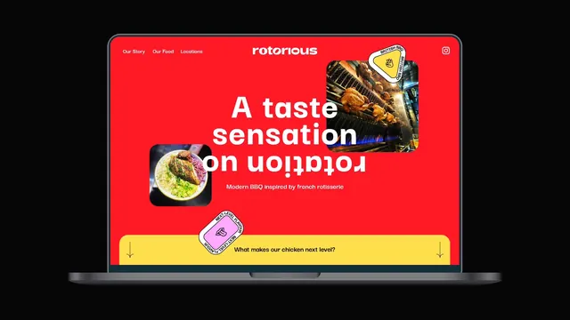
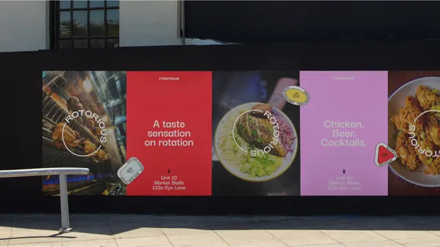
Laptop mockup on black showing a red homepage whose headline flips upside down on the word "rotation".
More like this
See all
Summary
A website hero shown on an open laptop, built on flat red with an oversized headline whose third line is rotated 180 degrees.
Visual description
An open silver laptop sits centred on a black background. On screen, a red page carries a small left-aligned nav reading "Our Story", "Our Food", "Locations", a centred lowercase "rotorious" wordmark, and an Instagram glyph at far right. The hero headline reads "A taste sensation on rotation" in white heavy sans across three centred lines, with the final line "on rotation" flipped upside down so it mirrors the line above. A short subline in smaller white type reads "Modern BBQ inspired by french rotisserie". Two square photographs with rounded corners are tucked into the headline block, one of a rotisserie rail at upper right, one of a plated dish at lower left. A yellow triangular "BRITISH BBQ" badge overlaps the top image. Below, a yellow rounded panel spans the width with "What makes our chicken next level?" and downward arrows at both ends.
Key takeaway
The name is dramatised by the layout: the word "rotation" is literally rotated, so the brand idea lands before a single line of copy is read. Small photo tiles nested inside the headline block keep the hero busy without a background image.
Reuse notes
A strong option for a food or nightlife brand whose name contains a verb or an action worth acting out typographically. The flipped line halves legibility, so it only survives on a short, familiar phrase and would need a plain fallback at mobile widths.