Preview image. Unlock full-res
Complete brand identity design carousel for PM-Casa, a Mexican home goods line, showing logomark, packaging design, and environmental signage.

Summary
A comprehensive brand identity system for PM-Casa, a Mexican home goods company, featuring a geometric logomark, modular packaging design, retail signage, and cohesive visual language across touchpoints.
Visual description
Slide 1: Double-stacked logomark treatment showing "PM-CASA" with subtitle "LÍNEA DE OBJETOS PARA EL HOGAR AUTÉNTICO MEXICANO" (Line of Objects for the Authentic Mexican Home). The mark uses a geometric, symmetrical form. Handwritten annotation circles frame the lockup, suggesting design thinking and cultural connection.
Slide 2: Packaged product mockup on black background-a pale olive shopping bag with large geometric pattern and matching circular container with label, showing the mark and descriptive text.
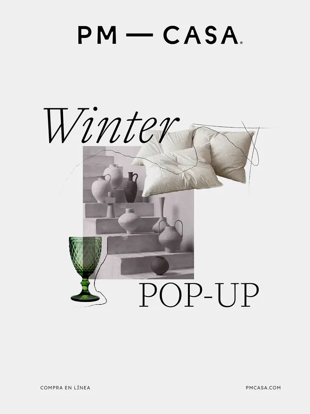
Slide 3: White retail signage mounted on black exterior wall. Winter pop-up poster layout combines the brand name with product imagery (fabric cushions, ceramic vessels) and call-to-action text in a collaged arrangement.
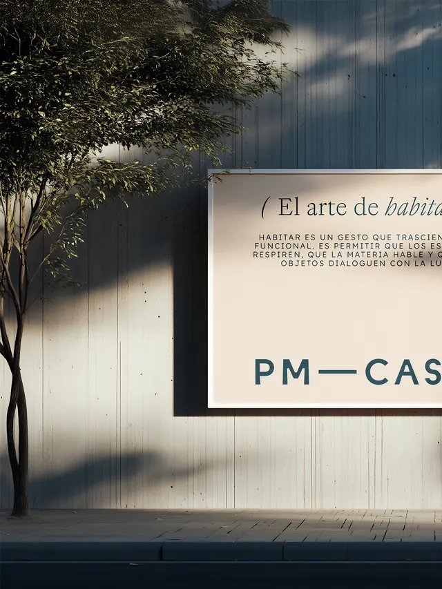
Slide 4: Architectural photograph showing the brand's philosophy text overlaid on white signage against a weathered blue corrugated metal wall, with natural tree shadow overlay. The text speaks to intentional living and material dialogue.
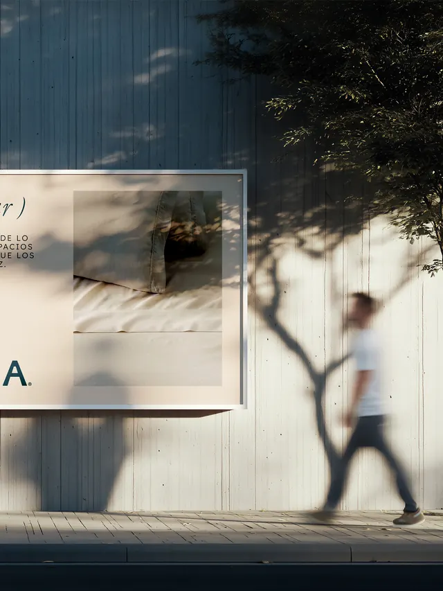
Slide 5: Tighter crop of signage detail showing brand mark and color palette integration.
Key takeaway
The modular logomark and neutral palette create a flexible system that scales from packaging to environmental design. The integration of Spanish language and cultural values directly into the brand narrative builds authenticity.
Reuse notes
Strong template for artisan or heritage-focused brands targeting conscious consumers. The minimalist approach paired with cultural specificity works particularly well for home goods and local/regional retail. The handwritten gesture adds humanity without compromising sophistication.
From this post: PM-Casa brand identity and packaging design system
View post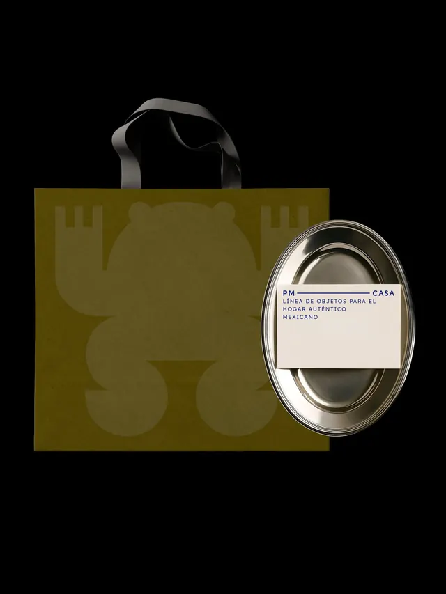
More like this


Keep what you find
A free account saves references to boards and can send you a weekly email of picks based on what you save.
To see every result, go Pro.