Preview image. Unlock full-res
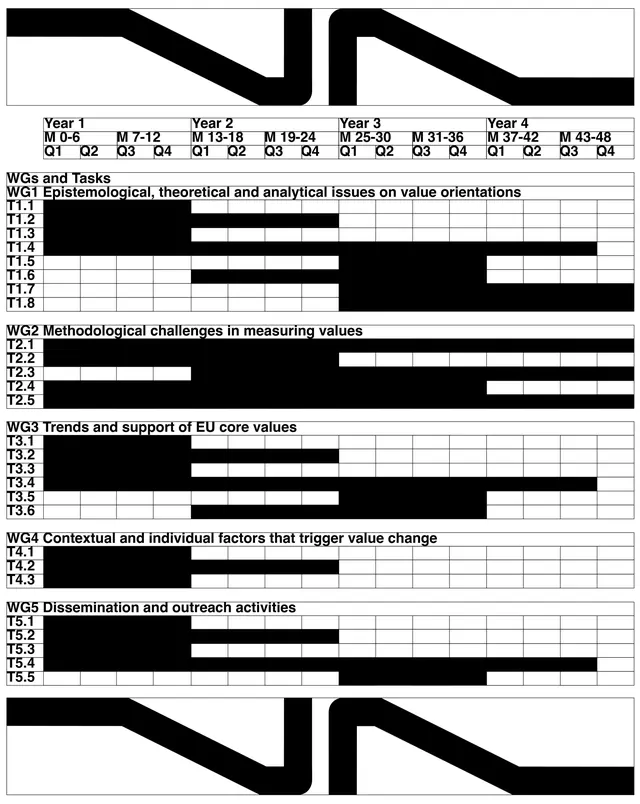
Academic research project identity featuring bold geometric sans-serif wordmark, black and white diagrams, risk matrices, and organized timeline/task documentation across 11 slides.

Summary
A comprehensive visual identity system for the Vista Cost-Action research project on values in turbulent times. The system spans logo and visual language, organizational flow, project timelines, risk matrices, and detailed task documentation in a structured, highly legible presentation.
Visual description
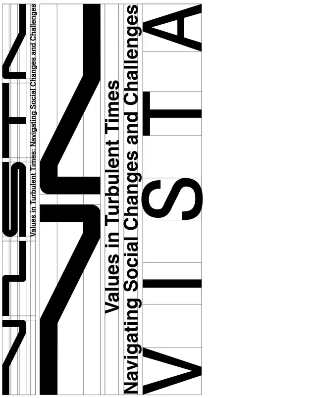
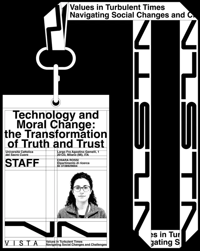
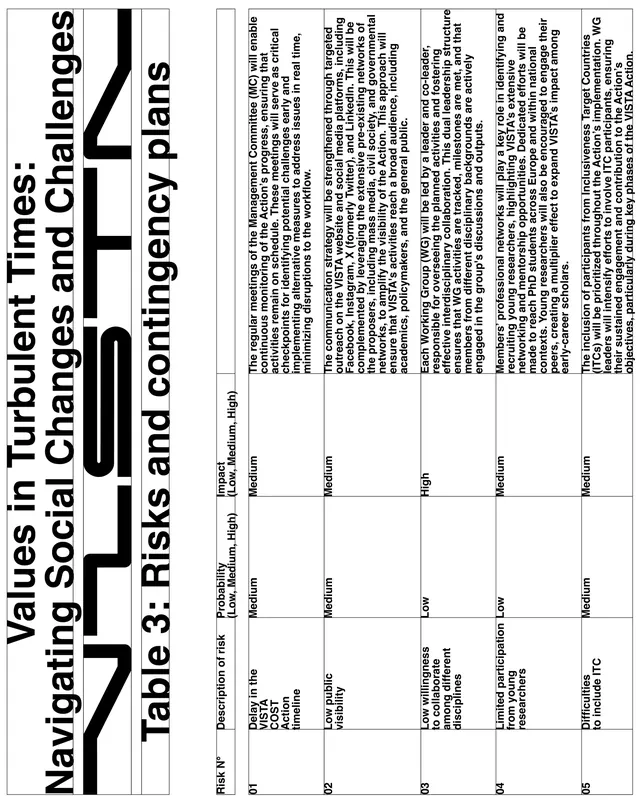
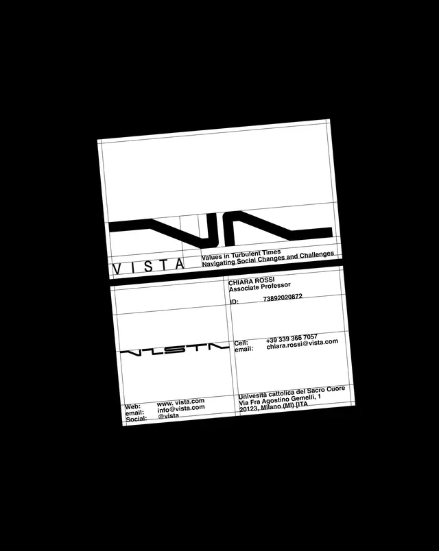
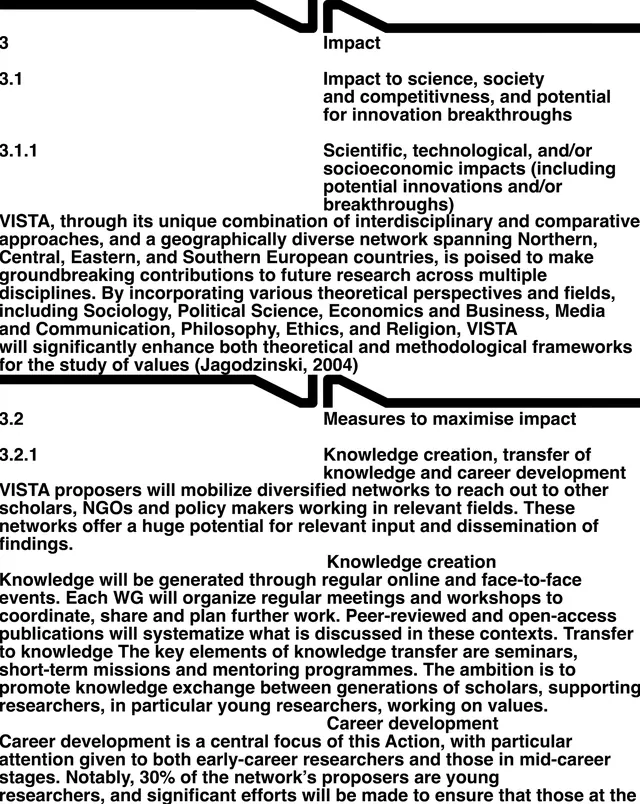
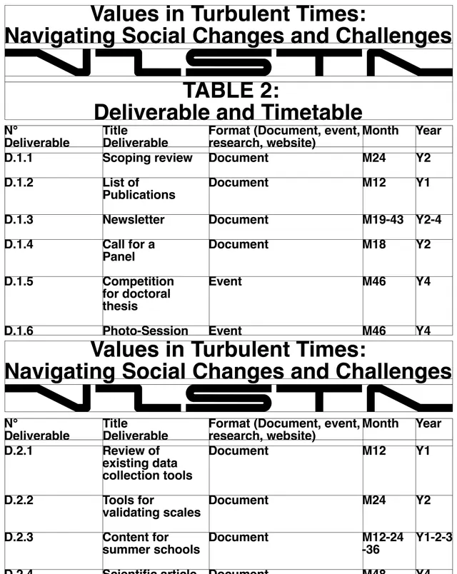
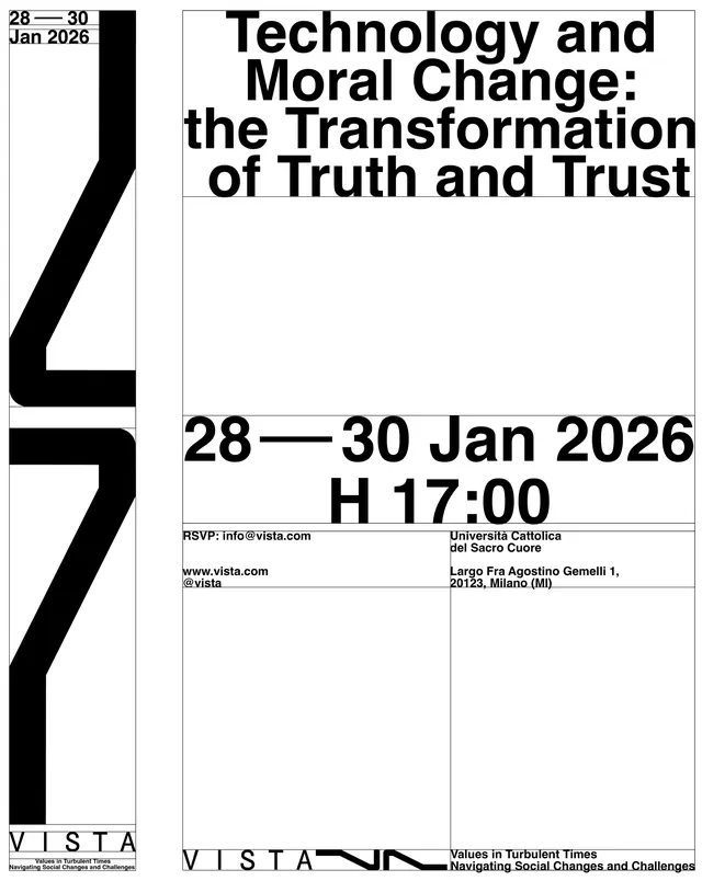
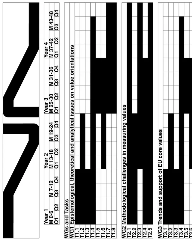
The carousel spans 11 slides documenting the complete identity system. Slide 1: A Gantt-style timeline chart showing 4-year project structure across working groups (WG1-WG5) with black bars indicating task schedules and quarterly divisions. Slide 2: Large-format title card ("Values in Turbulent Times Navigating Social Changes and Contingency Plans") with bold black sans-serif hierarchy and secondary color band in contrasting tone. Slide 3: Institutional branding context with full project title, venue (Università Cattolica), and contact information. Slides 4-5: Risk matrix and assessment table with row headers (Impact/Probability dimensions), structured cells filled with descriptive text, and legend. Slides 6-7: Organizational diagrams and process flows rendered in black and white with clear hierarchy. Slides 8-9: Detailed task breakdown and deliverable timeline with structured tabular format, meticulous typography. Slides 10-11: Event information and final project structures with tight grid layouts. Throughout: pure black and white, bold sans-serif headlines, restrained secondary typography, generous use of white space, and structured grids. No decorative elements-visual clarity through information hierarchy and spatial organization.
Key takeaway
Institutional identity through pure information design. The geometric wordmark with angled cut creates a visual signature; the rest of the system is ruthlessly functional. Structured grids and clear typographic hierarchy make complex research information navigable. This is how to make data-dense documentation not just legible but visually compelling.
Reuse notes
Excellent template for EU research projects, academic consortiums, and institutional identity systems. The monochrome aesthetic and structured approach work well for publications, grant applications, and formal presentations. The system scales to large document sets (proposals, reports, newsletters) while maintaining visual cohesion. Strong for governance-heavy organizations where clarity and professionalism are non-negotiable. Works best when paired with human photography or color accent bands for posters/event marketing (breaks the monochrome when needed). The tight grid approach demands careful typography-less is more.
From this post: Vista research project identity system
View post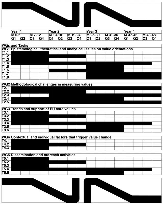
More like this


Keep what you find
A free account saves references to boards and can send you a weekly email of picks based on what you save.
To see every result, go Pro.