Preview image. Unlock full-res
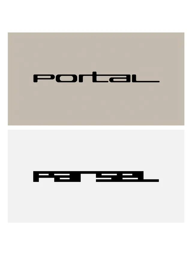
Two minimalist geometric wordmarks rendered in bold sans-serif, "Portal" in traditional form and "Parsel" as a deconstructed typographic experiment with fragmented letterforms.

Summary
Two wordmarks side-by-side demonstrating contrasting typographic approaches: Portal as a solid, readable geometric sans-serif, and Parsel as a fragmented, algorithmic deconstruction of the same letterforms with visual gaps and shifts.
Visual description
The composition is split vertically. Upper half: warm tan/beige background with centered black geometric sans-serif wordmark "Portal" rendered in a modern, humanist typeface with subtle flared terminals. Strong, readable, finished. Lower half: light gray background with the wordmark "Parsel" rendered in the same underlying type but with aggressive visual fragmentation-horizontal scan-line breaks, internal negative space, and character shifts creating a glitched or digitally manipulated effect. Both wordmarks are all-caps, centered, generous letter spacing, and sized identically for direct comparison. The color contrast (black on warm/cool neutrals) emphasizes geometry and form. The upper wordmark reads as confident and complete; the lower as deconstructed and experimental, suggesting systems thinking or digital transformation.
Key takeaway
Type as communication (Portal) vs. type as interrogation (Parsel). The side-by-side comparison shows how the same underlying geometry can express polished, professional identity or avant-garde, exploratory positioning depending on treatment. The deconstructed version suggests algorithms, data, and future-forward thinking without losing readability.
Reuse notes
Compelling for tech startups, software products, and design studios that want to signal both professionalism and innovation. The split approach works well as a brand evolution narrative or dual-identity system (polished external brand + experimental internal culture). The deconstructed wordmark technique works best in limited applications (hero imagery, posters) rather than everywhere. Strong for AI/ML platforms, digital tools, and speculative design. The minimalist monochrome approach is timeless and works across media.