Preview image. Unlock full-res
A twelve-slide comprehensive brand identity for SOUZO by maruman featuring bold color blocking, geometric forms, and packaging system applications.

Summary
A twelve-slide brand identity presentation for SOUZO by maruman showcasing a complete visual system with bold color blocking, geometric typography, and comprehensive packaging applications designed by motoishito and motoifuruya.
Visual description
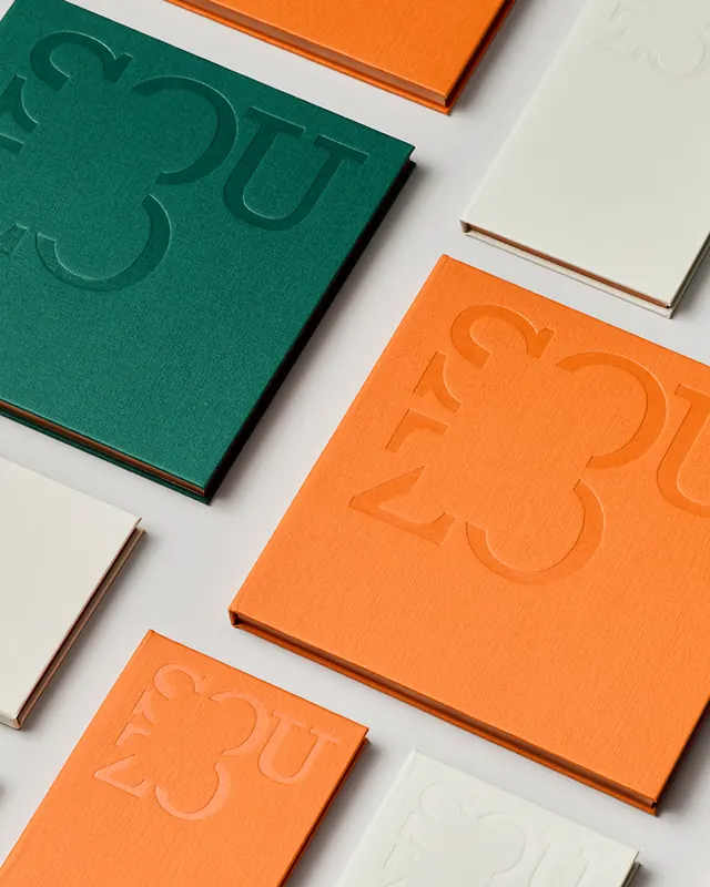
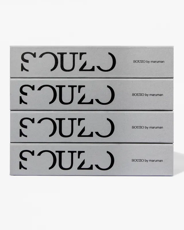
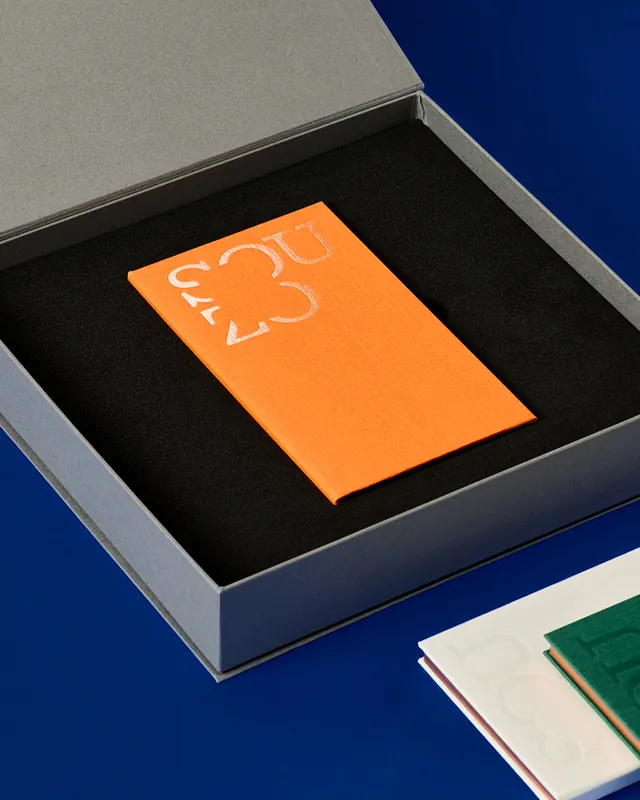
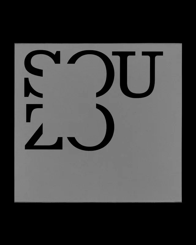
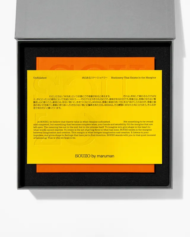
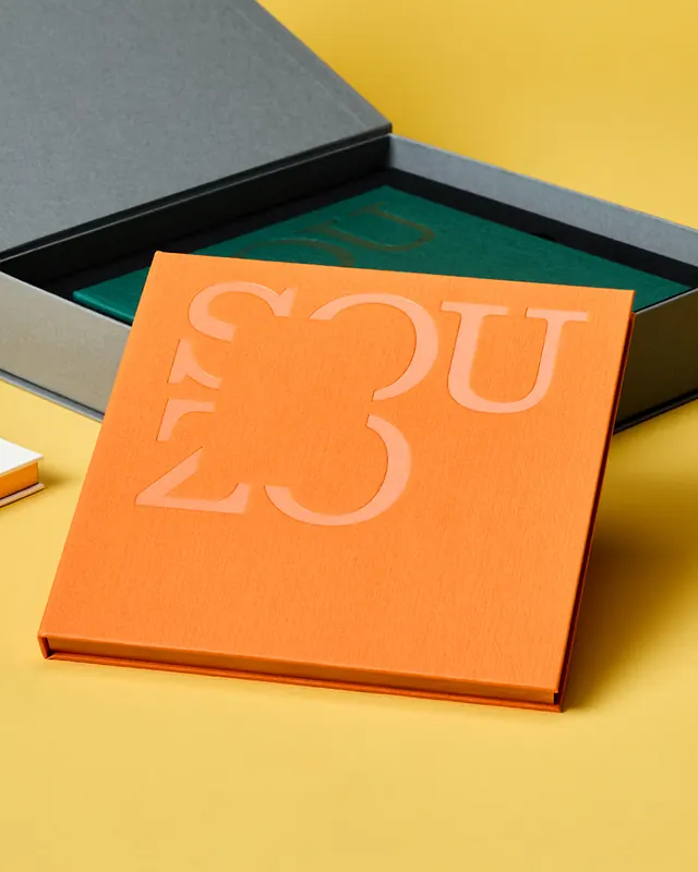
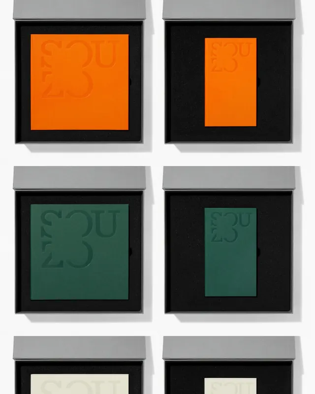
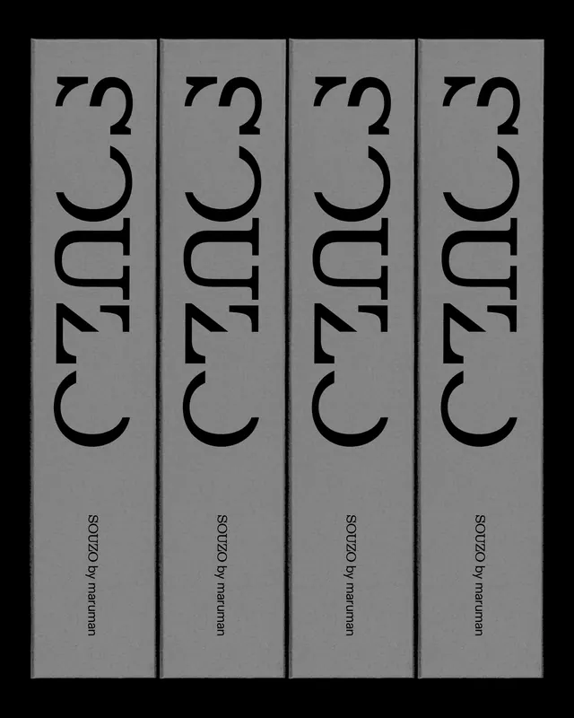
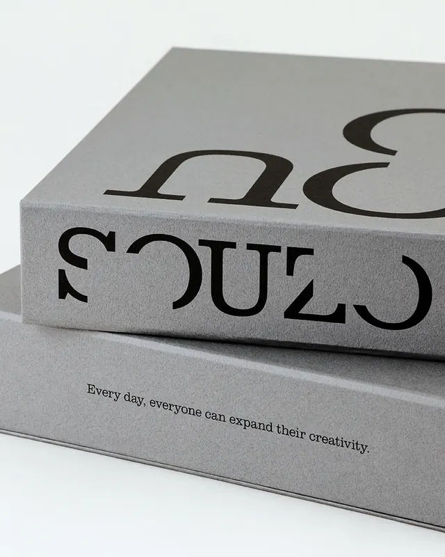
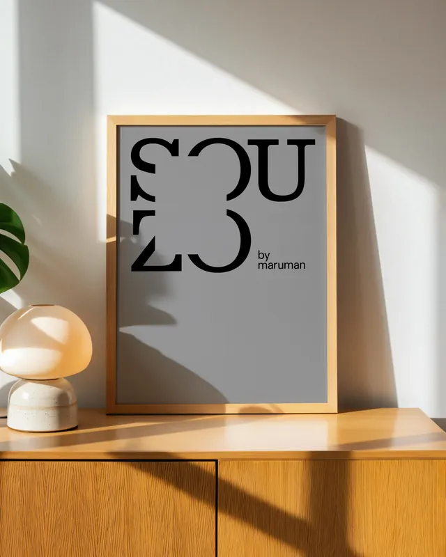
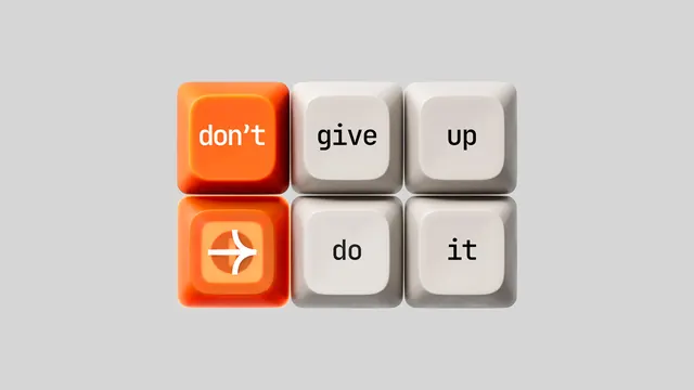
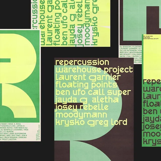
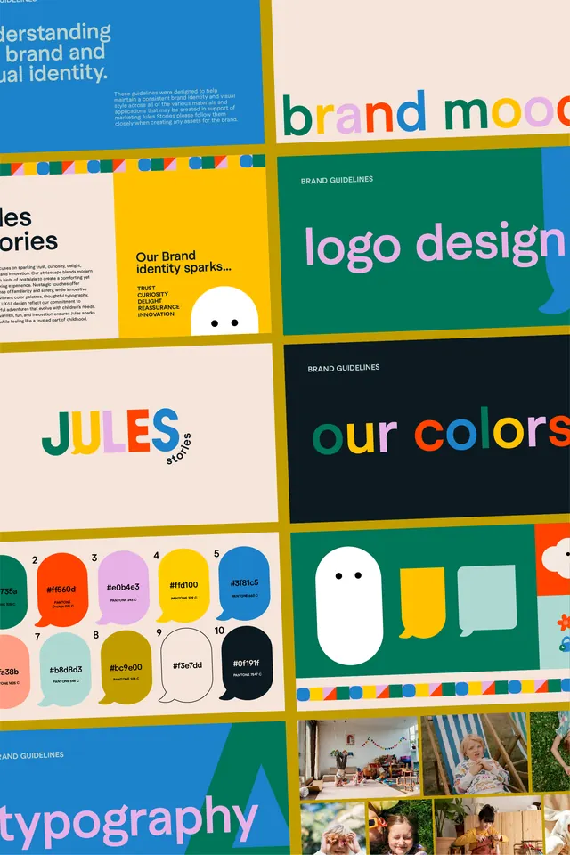
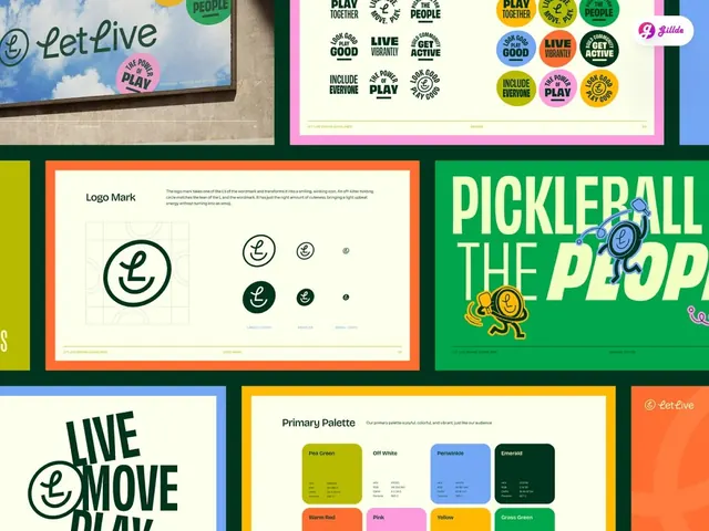
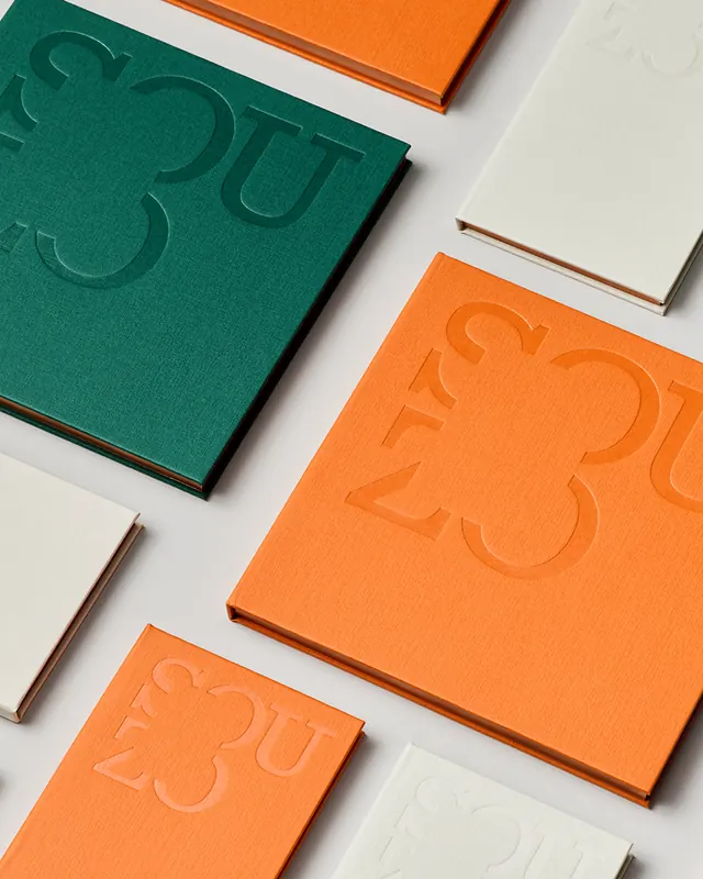
The carousel opens with product packaging featuring the SOUZO brand mark applied to colored boxes stacked at an angle, introducing the primary color palette of vibrant orange, teal, and cream. Subsequent slides reveal individual branded items: napkins, printed materials, books, and stationery. The typography is geometric and modern with interesting letterforms. A stacked horizontal card system displays the brand name repeated across different materials. Product photography shows the packaging in lifestyle contexts, demonstrating how the bold, simple color blocking creates impact on shelves. Typography appears in both modern sans-serif and serif combinations. The black-and-white slides showcase the monochrome application of the mark, proving versatility. Later slides feature book covers, editorial layouts, and a comprehensive brand guidelines document showing the system's coherence across multiple applications.
Key takeaway
Bold, high-contrast color choices make the system instantly recognizable and memorable. The geometric letterforms paired with simple, clean compositions create a distinctive visual language. Consistent application across diverse touchpoints (packaging, print, digital mockups) demonstrates system strength and flexibility.
Reuse notes
Effective for brands targeting contemporary audiences who appreciate bold design gestures. The approach works particularly well for lifestyle and consumer products where shelf impact matters. The geometric language suggests innovation and modernity. Requires disciplined application to prevent the boldness from feeling scattered. Strong typography is essential to balance the vibrant colors.