Preview image. Unlock full-res
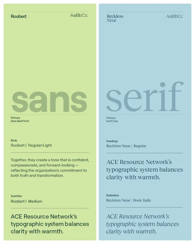
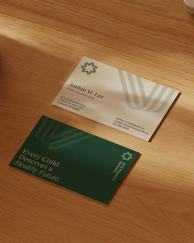
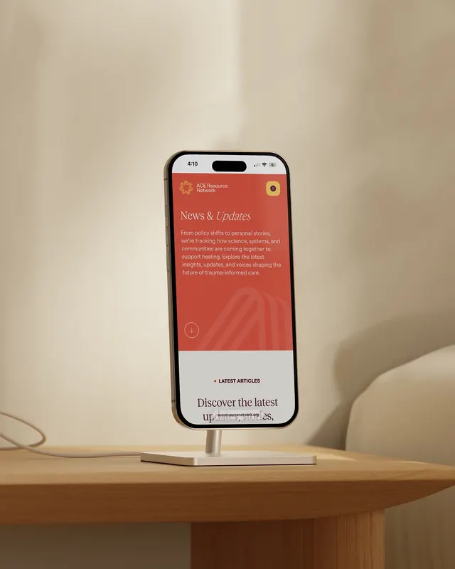
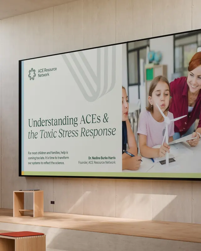
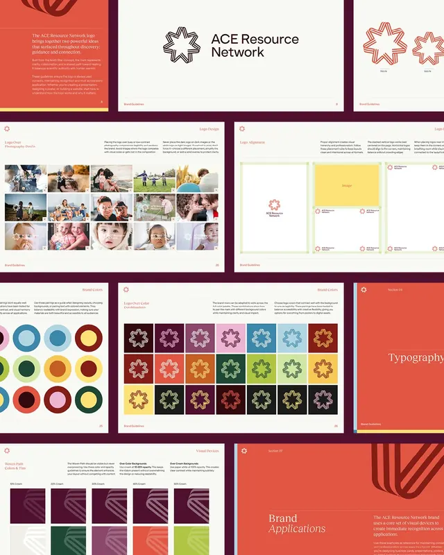
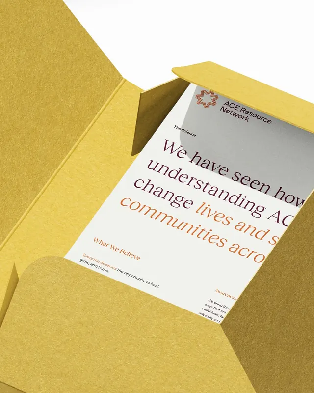
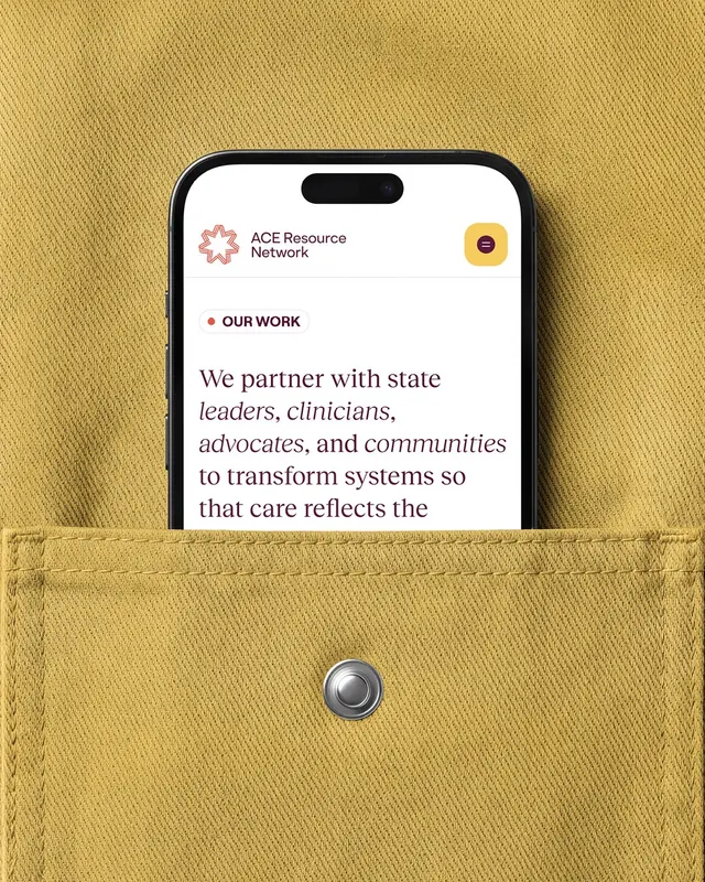
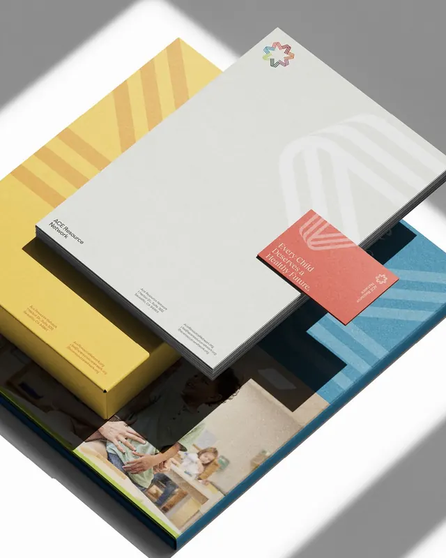
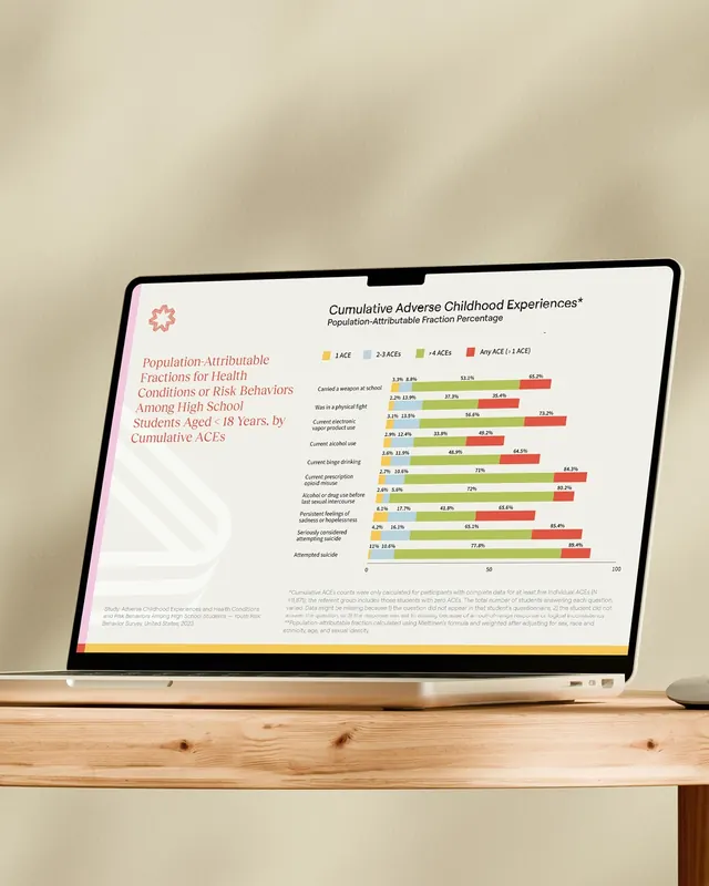
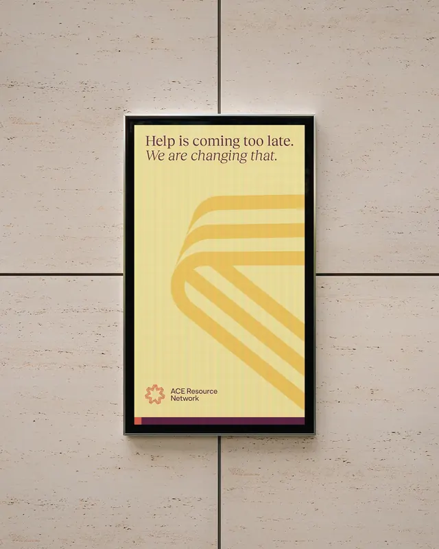
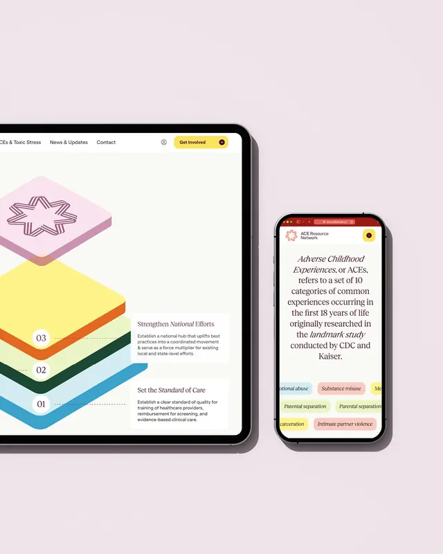
A fifteen-slide brand identity carousel for ACE Resource Network, a national nonprofit addressing childhood trauma, featuring a comprehensive system of warm color, compassionate typography, icon patterns, and applied collateral mockups.

Summary
Slide 1 of the "ACE Resource Network brand identity case study" Instagram carousel. A fifteen-slide brand identity carousel for ACE Resource Network, a national nonprofit addressing childhood trauma, featuring a comprehensive system of warm color, compassionate typography, icon patterns, and applied collateral mockups.
Visual description
One slide from the "ACE Resource Network brand identity case study" carousel post. See the parent carousel item for the full visual description across all slides.
Key takeaway
Part of the "ACE Resource Network brand identity case study" set; the parent carousel item carries the full analysis.
Reuse notes
Use this slide on its own or open the parent item to browse the whole carousel in order.
From this post: ACE Resource Network brand identity case study (slide 1)
View post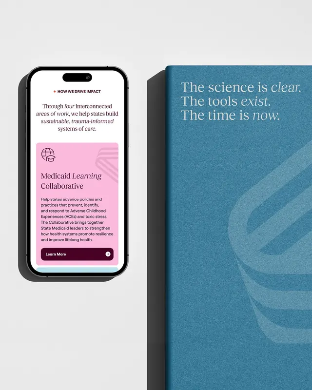

More like this




Keep what you find
A free account saves references to boards and can send you a weekly email of picks based on what you save.
To see every result, go Pro.