Preview image. Unlock full-res
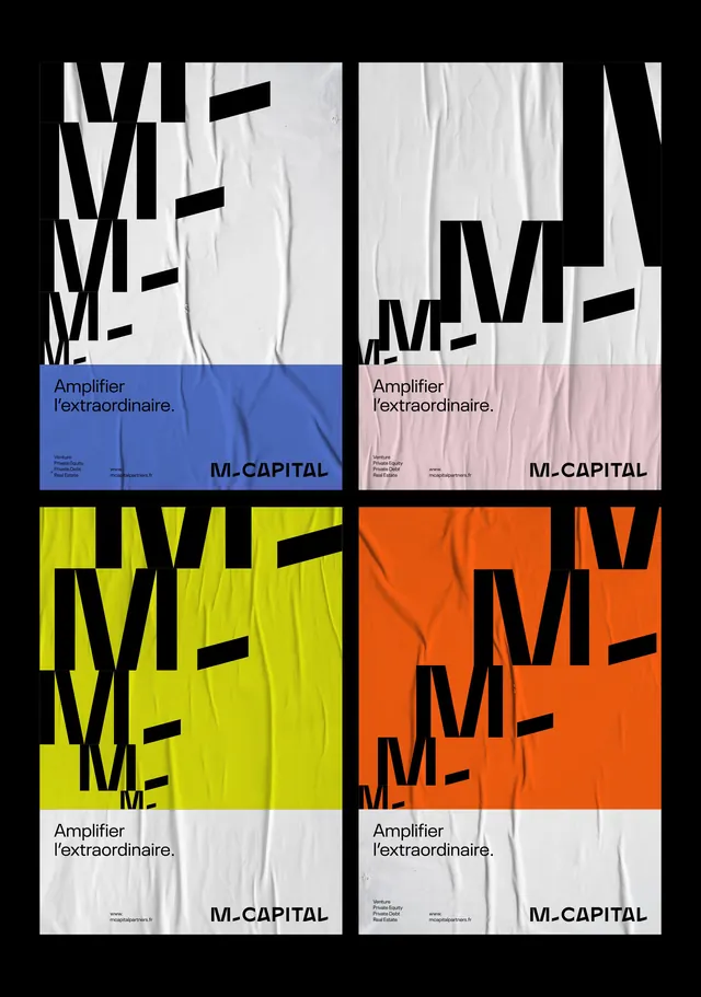
M. Capital brand identity presented as a 2x2 grid of color-blocked panels, each showing bold geometric letterforms in contrasting neutral and vibrant backgrounds.
Summary
M. Capital brand identity presented in four color variations arranged in a 2x2 grid, each pairing large geometric letterforms with distinct color-blocked backgrounds.
Visual description
Four square panels in a 2x2 grid, each dominated by oversized black geometric letterforms spelling "ME" in a bold sans-serif display font. Top-left shows neutral cream background; top-right, pale pink/mauve; bottom-left, vibrant neon yellow; bottom-right, bright orange. Each panel includes "Amplifier l'extraordinaire." tagline and "M-CAPITAL" logo at the bottom in smaller type. The composition is stark and clean, with crumpled textile texture visible across the letterforms and backgrounds, grounding the graphic treatment.
Key takeaway
Demonstrating brand color range through a systematic grid layout. The contrast of oversized bold type against solid backgrounds, paired with subtle texture, creates visual interest while maintaining clarity and institutional credibility.
Reuse notes
Effective for corporate identity systems, financial services, or B2B brands needing to showcase color flexibility without additional visual elements. The 2x2 grid format is compact and presentation-ready. Works best with bold, geometric typographic treatments.
More like this




Keep what you find
A free account saves references to boards and can send you a weekly email of picks based on what you save.
To see every result, go Pro.