Preview image. Unlock full-res
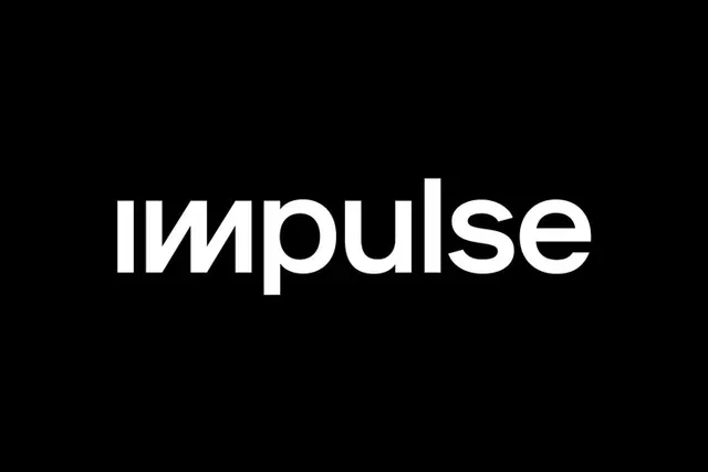
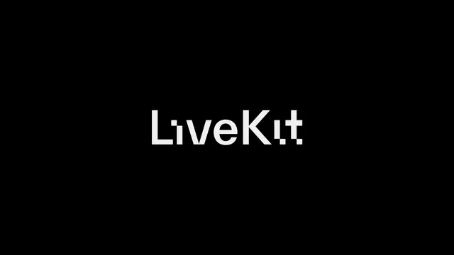
The LiveKit wordmark alone in white on pure black, a geometric sans whose dots and terminals are broken into offset square blocks.
More like this
See all
Summary
A bare presentation of the LiveKit logotype, white on black, with nothing else in frame so the modular square cuts in the letterforms carry the whole image.
Visual description
Solid black field, wide format, with the wordmark centred and occupying roughly a third of the width. The lettering is a tight geometric sans in off white, lowercase forms mixed with two capitals in Live and Kit. Several letters are deliberately fractured into square modules. The dot over the i is a small square sitting low and offset from the stem, the i in Kit repeats the same trick, the crossbar of the t is a detached block set slightly high, and the leg of the K breaks away from its stem as an independent diagonal. Stroke weights are even, counters are open and the spacing is generous, so the fractures read as intent rather than damage. No tagline, no symbol, no framing device.
Key takeaway
One square module, applied only at the joints and terminals, converts an ordinary geometric sans into a proprietary logotype. Keeping the fractures on the small details and leaving the main stems untouched means the word stays instantly readable at any size.
Reuse notes
The reference to reach for when a developer or infrastructure brand needs a wordmark with a technical signature but no icon. Works best reversed on black at this scale. The detached crossbar and K leg will start to fill in or vanish at small sizes, so a simplified small use cut is worth planning alongside it.