Preview image. Unlock full-res
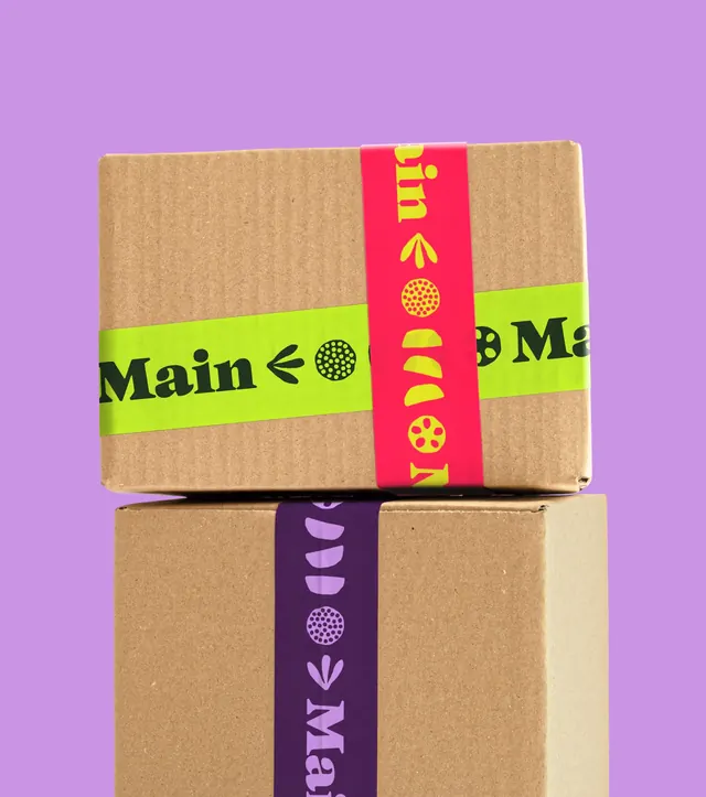
Two stacked kraft cardboard boxes sealed with lime, pink and purple branded packing tape carrying the Main wordmark and icon glyphs, on a lilac background.
More like this
See all
Summary
Branded packing tape treated as the entire packaging system: plain kraft boxes with nothing printed on them, sealed by three colourways of a repeating wordmark and glyph strip.
Visual description
Two unprinted corrugated boxes are stacked against a flat lilac background, the upper one turned slightly so its top face and front are both visible. A lime tape runs horizontally across the front of the top box, printed in dark green with the serif "Main" wordmark followed by a small arrow, a dot-filled circle and a partial repeat. A hot pink tape crosses it vertically over the lid, printed in yellow with the same sequence rotated, showing an arrow, a dotted circle, a pair of leaf shapes and a spotted round form. The lower box carries a deep purple tape down its front face printed in lilac with the same repeating pattern. Kraft brown, the printed tape and the lilac ground are the only surfaces; there are no labels, stickers or printed boxes.
Key takeaway
Colour-coded tape over stock kraft is a low cost way to brand shipping without printing custom boxes, and running the repeat both horizontally and vertically makes one artwork read as a system. Alternating which two colours pair up keeps the same tape from looking like a single sku.
Reuse notes
Ideal for ecommerce, subscription food boxes and any brand shipping at volumes too small to justify printed cartons. Needs a wordmark and a handful of simple glyphs that survive at tape width. Note that the repeat lands wherever the cut falls, so the artwork has to look intentional when the wordmark is sliced.