Preview image. Unlock full-res
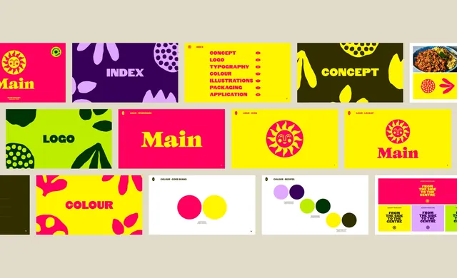
A grid of brand guideline slides for a plant-based food brand, cycling through hot pink, yellow, lime, purple and dark olive with cut-out plant illustrations.
More like this
See all
Summary
Three rows of brand guideline slides laid out flat on a warm grey backdrop, showing how one food identity runs across a small set of saturated flat colours and a cut-paper illustration language.
Visual description
Slides sit edge to edge in three rows on a putty grey field, each one a full-bleed colour panel. The top row runs a hot pink cover with a yellow sun mark and a serif "Main" wordmark, a deep purple "INDEX" slide scattered with lilac leaf and seed shapes, a yellow contents list setting CONCEPT, LOGO, TYPOGRAPHY, COLOUR, ILLUSTRATIONS, PACKAGING and APPLICATION in heavy pink all-caps with small dot markers, a dark olive "CONCEPT" divider, and a white slide with a food photograph. The middle row is the logo section: a lime divider reading "LOGO", a pink slide with the yellow serif wordmark set large, a yellow slide holding the pink sun icon centred, and a lockup slide stacking icon over wordmark. The bottom row covers colour: a yellow divider, then white specification pages with flat circular swatches, one pair for the core brand and a descending diagonal of six for recipe variants, each annotated with small print. A packaging preview at the right repeats the line "FROM THE SIDE TO THE CENTRE" across pink, yellow and lilac panels. Every slide carries a small circular sun badge in its top left corner and a page number.
Key takeaway
The dividers do the heavy lifting: each section opens with a single word set huge on a different flat colour, so the deck reads as a rhythm of colour rather than a document. Pairing a warm serif wordmark with a heavy geometric all-caps sans keeps the playful palette from tipping into chaos.
Reuse notes
A good reference for a food or consumer brand guideline deck that needs to feel appetising rather than corporate. The approach depends on having a genuinely wide colour set, at least five that hold up as full-bleed backgrounds. Pairs well with cut-paper or collage illustration and with packaging that repeats a single brand line.
More like this

Keep what you find
A free account saves references to boards and can send you a weekly email of picks based on what you save.
To see every result, go Pro.