Preview image. Unlock full-res
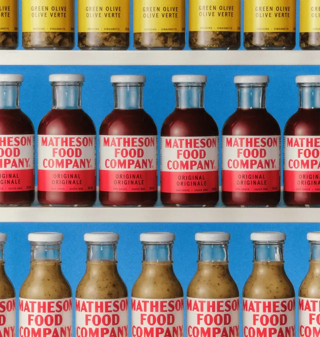
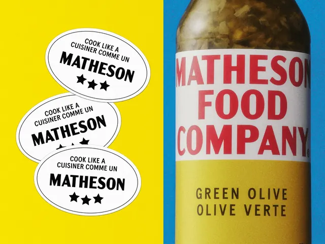
Straight-on retail shelf shot of repeating bottles and jars whose red-on-white condensed wordmark reads as a single block of type across a bright blue backdrop.
More like this
See all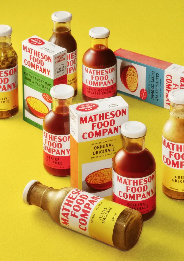
Summary
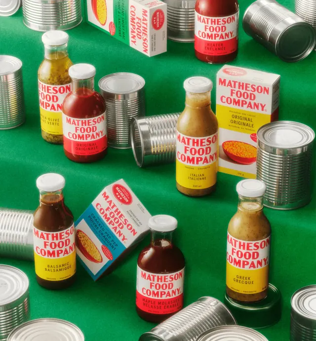
Three shelves of Matheson Food Company product shot flat and cropped so the rows run off both edges, turning the repeated wordmark into a horizontal band of type.
Visual description
The top shelf holds squat jars with yellow label blocks reading "GREEN OLIVE / OLIVE VERTE" over "DRESSING . VINAIGRETTE 350 ML" in small letterspaced caps. The middle shelf, set against a saturated mid blue wall, carries deep red BBQ sauce bottles with white screw caps: each label is a white upper band with "MATHESON FOOD COMPANY" set in three lines of heavy condensed red caps followed by a red band with "ORIGINAL / ORIGINALE" reversed in white and a fine rule of caps at the base. The bottom shelf repeats the system in pale olive green dressing bottles. Every label pairs English with French at the same weight. The photograph is soft and slightly grainy, with shelf edges cutting clean white horizontals through the blue.
Key takeaway
The label does the layout work: a white type panel over a flavor color band means a whole range shares one silhouette while each variant stays legible from a distance. Cropping the shot so the rows repeat past the frame sells range depth without needing a full product lineup.
Reuse notes
A strong reference for CPG and pantry brands that need many SKUs to read as one family on shelf. Depends on a genuinely bold condensed wordmark and a hard colored backdrop; on a neutral shelf the same labels would flatten out. Pairs well with flat-lay range shots that show the same labels off shelf.